| BRANDING CASE STUDY
Kinetik Capital // HvBrands® -2024
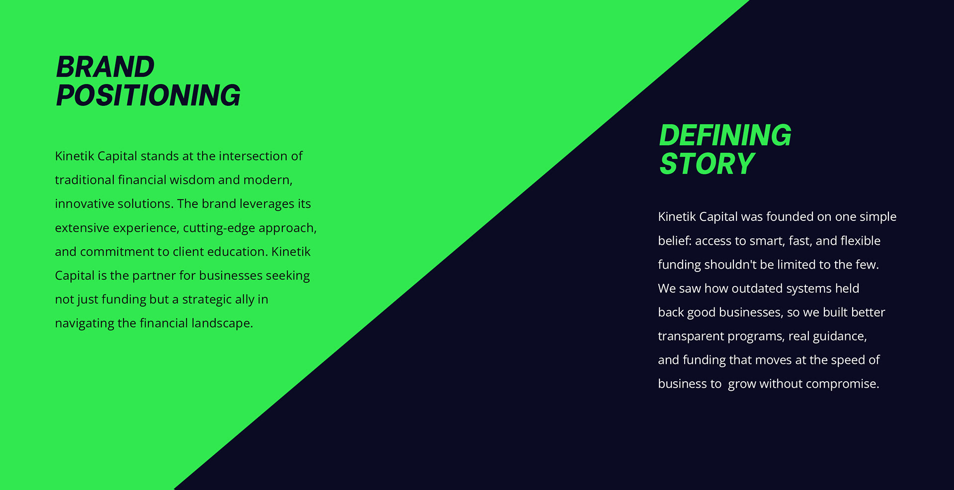
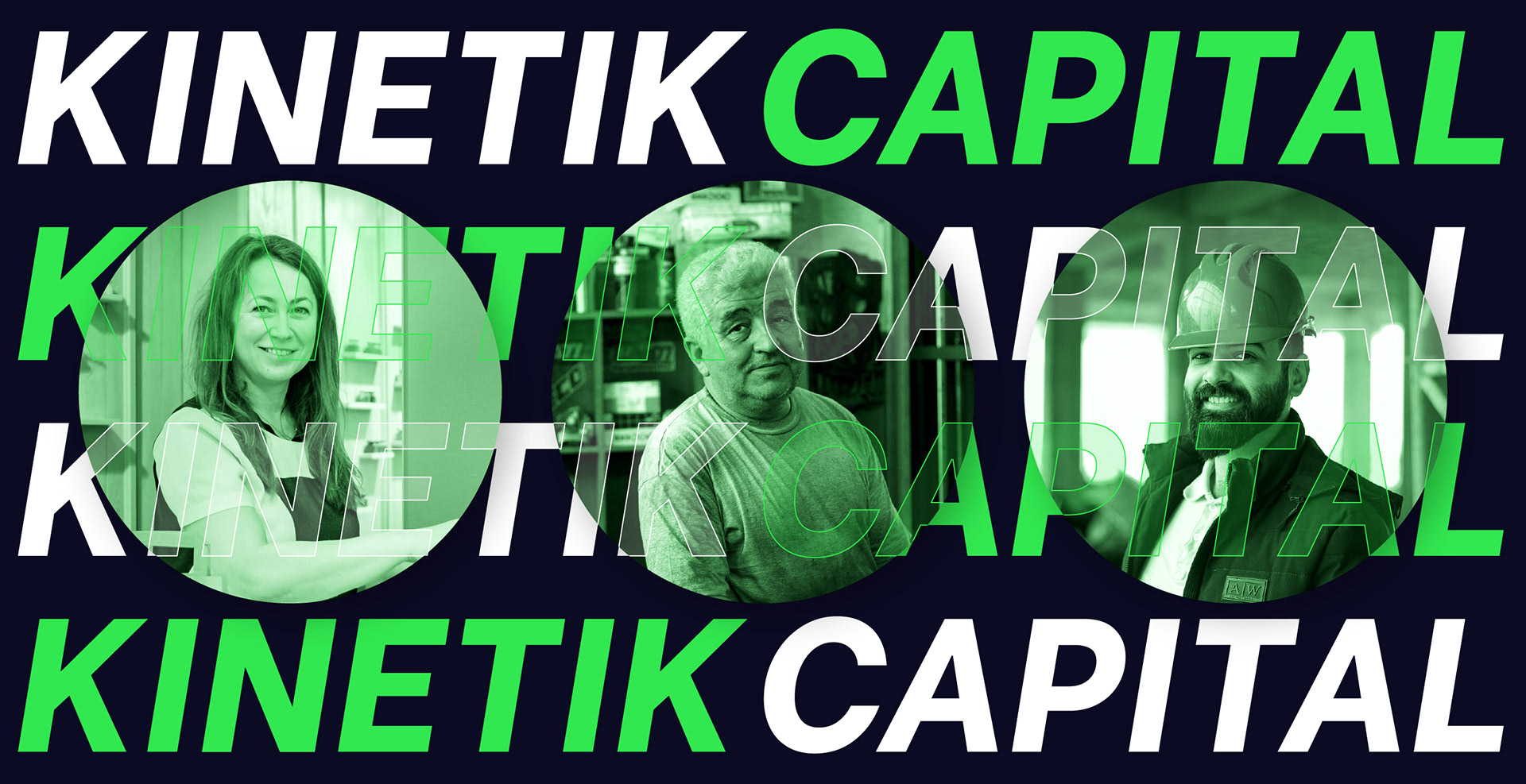
Kinetik Capital is a modern commercial finance company on a mission to unlock smarter, faster, and more flexible funding for everyday businesses. When the founders reached out, their ask was clear: help us stand out in a saturated, often stale industry without compromising on trust or clarity.
The challenge was to build a system that conveys professionalism and financial expertise, while feeling approachable, smart, and fast-moving. This brand wasn’t about prestige or corporate coldness, it was about momentum, trust, and empowerment.
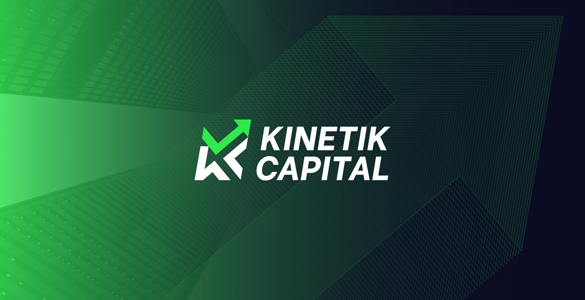
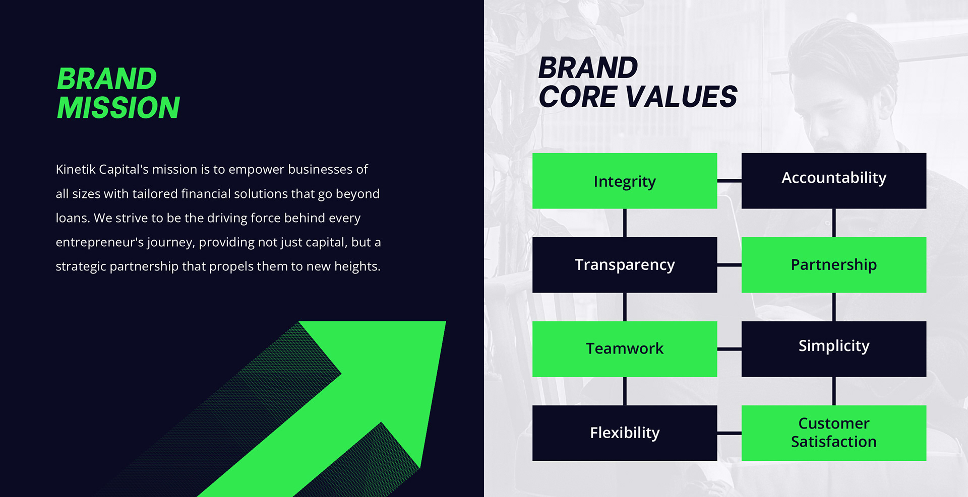
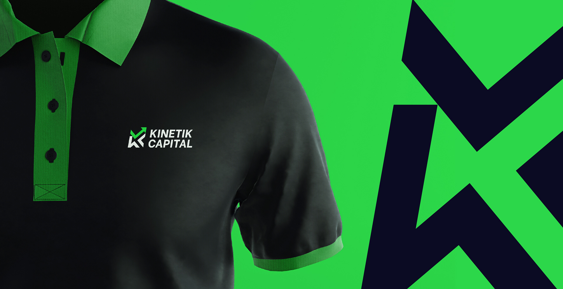
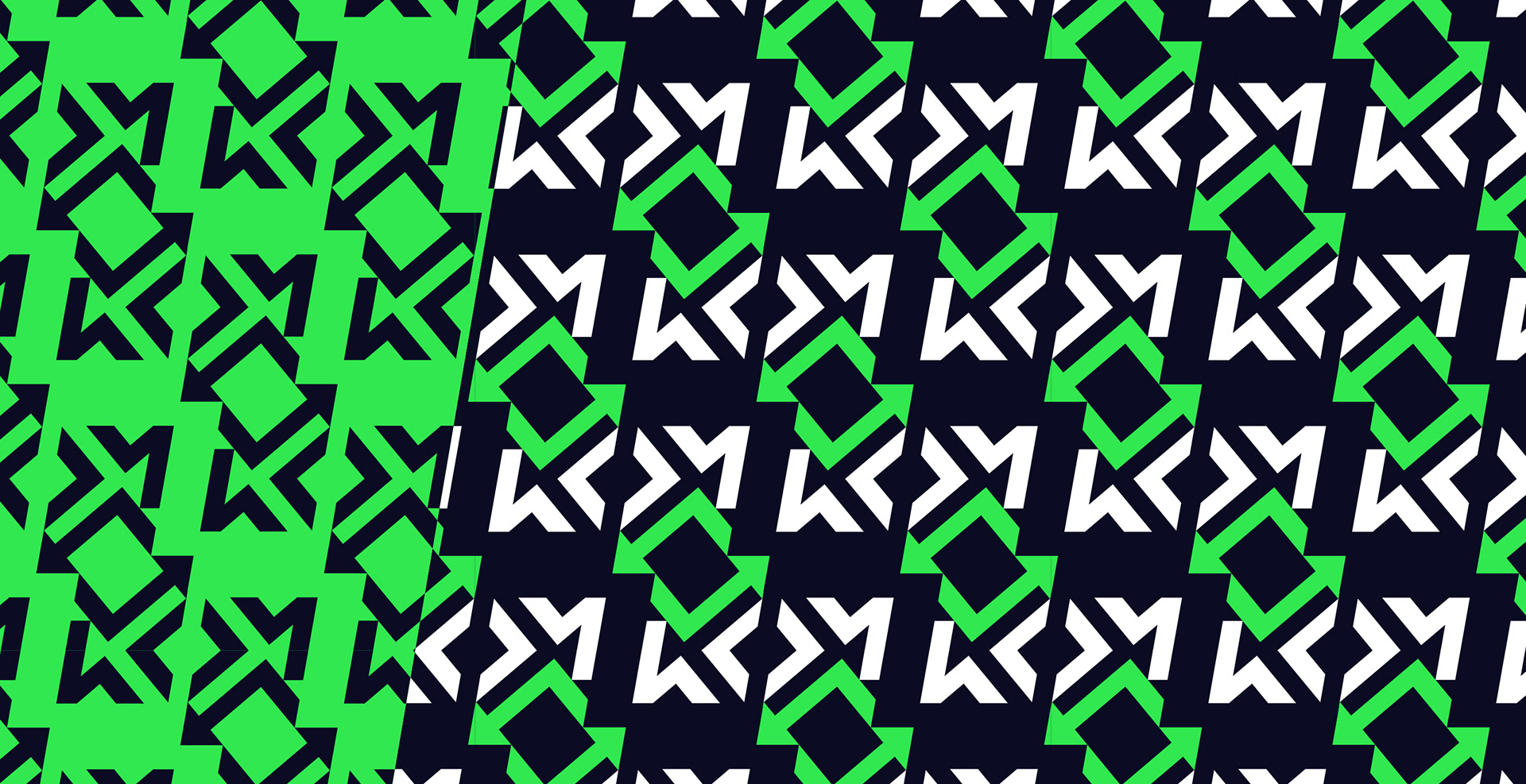
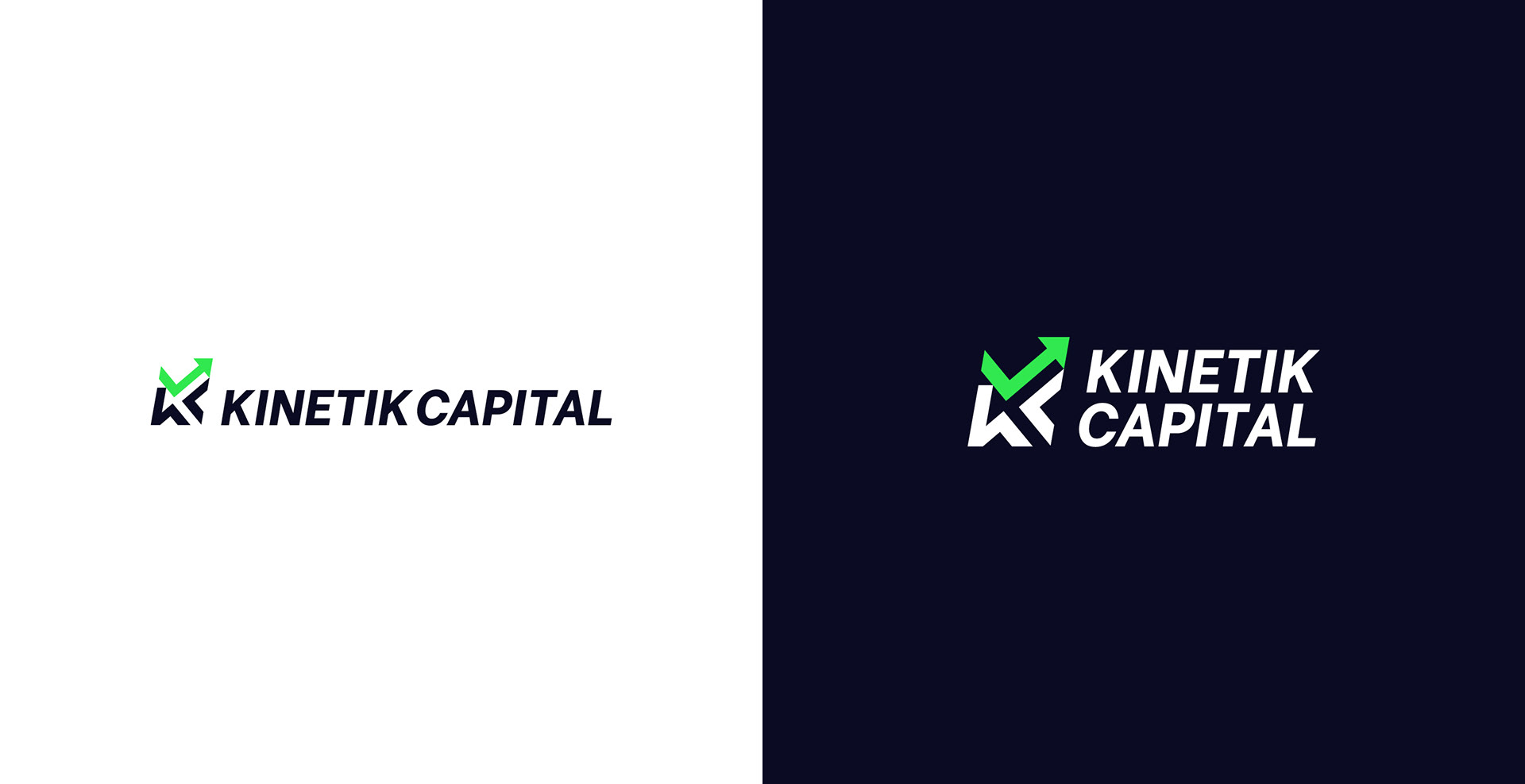
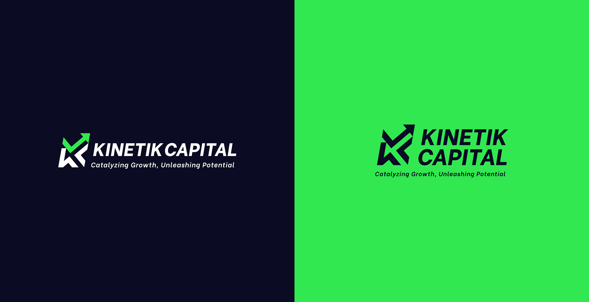
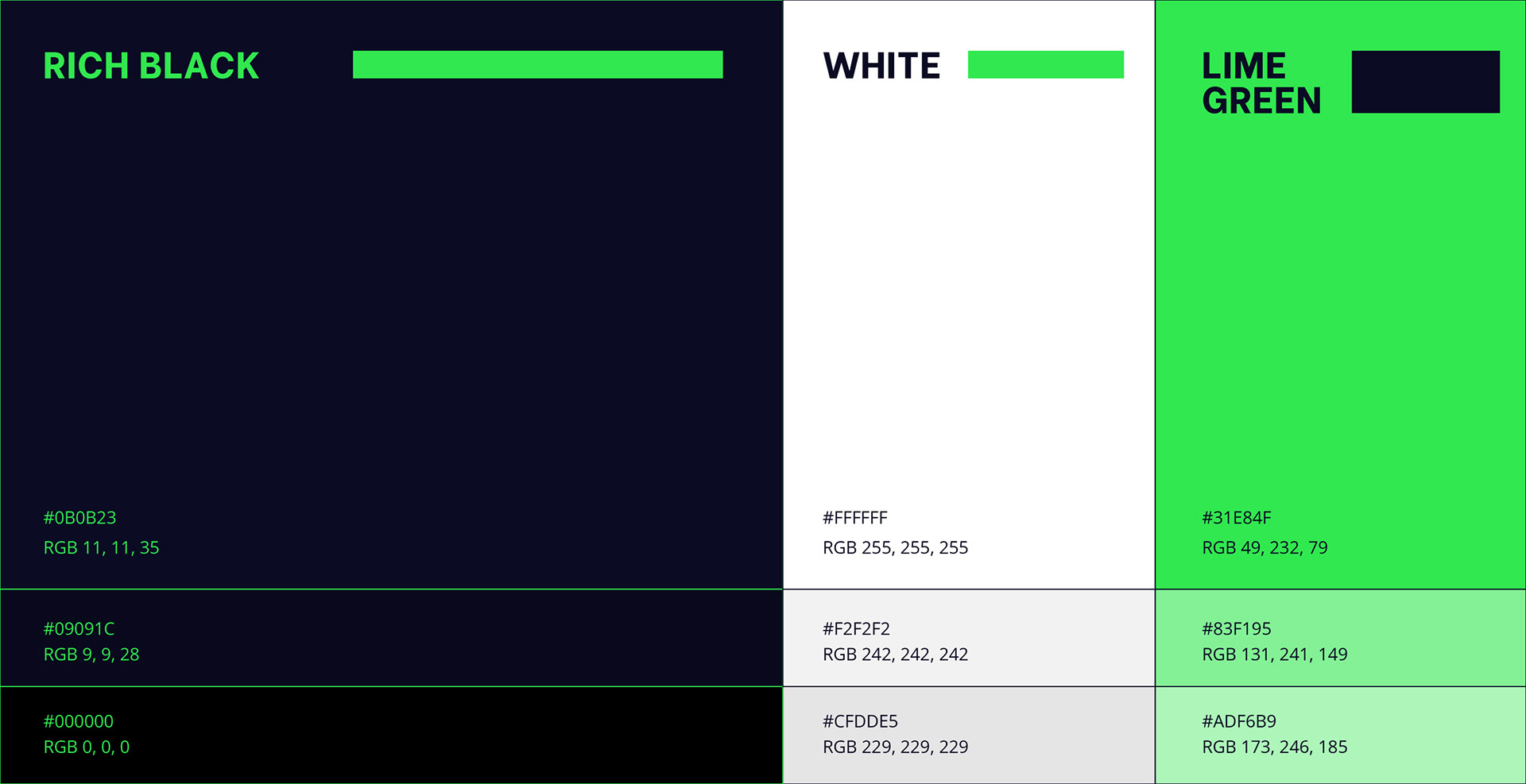
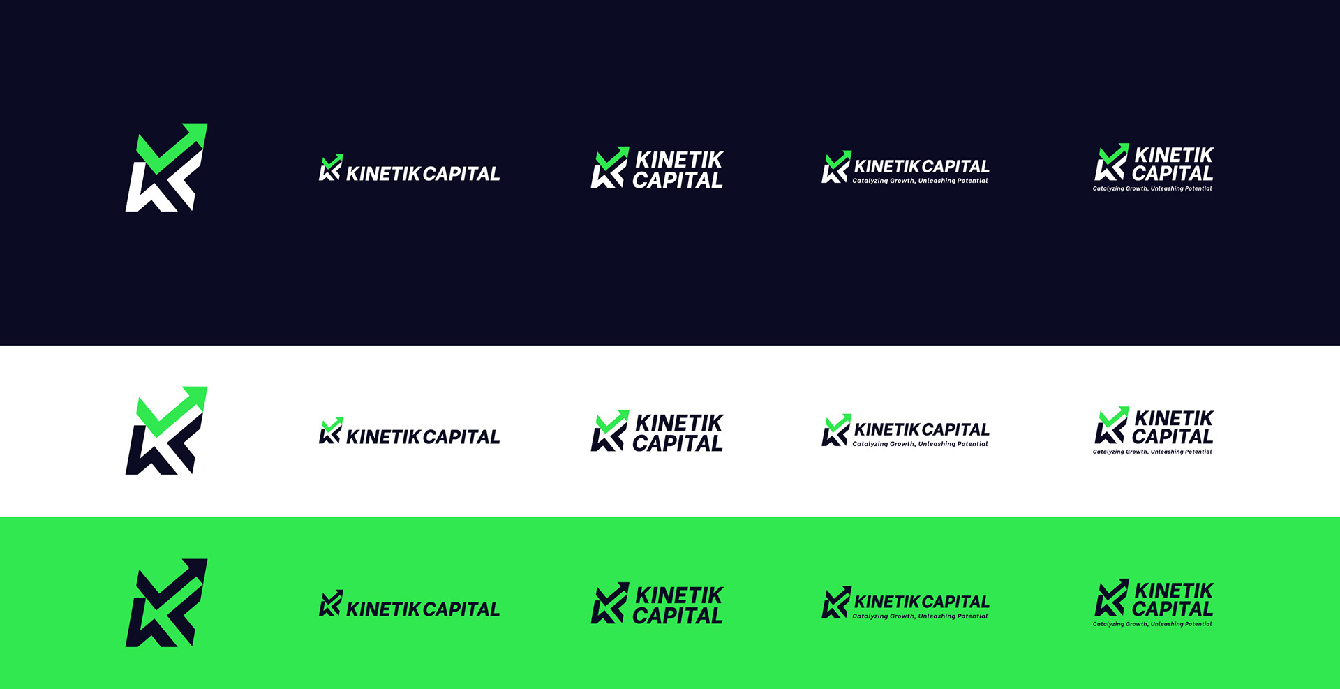
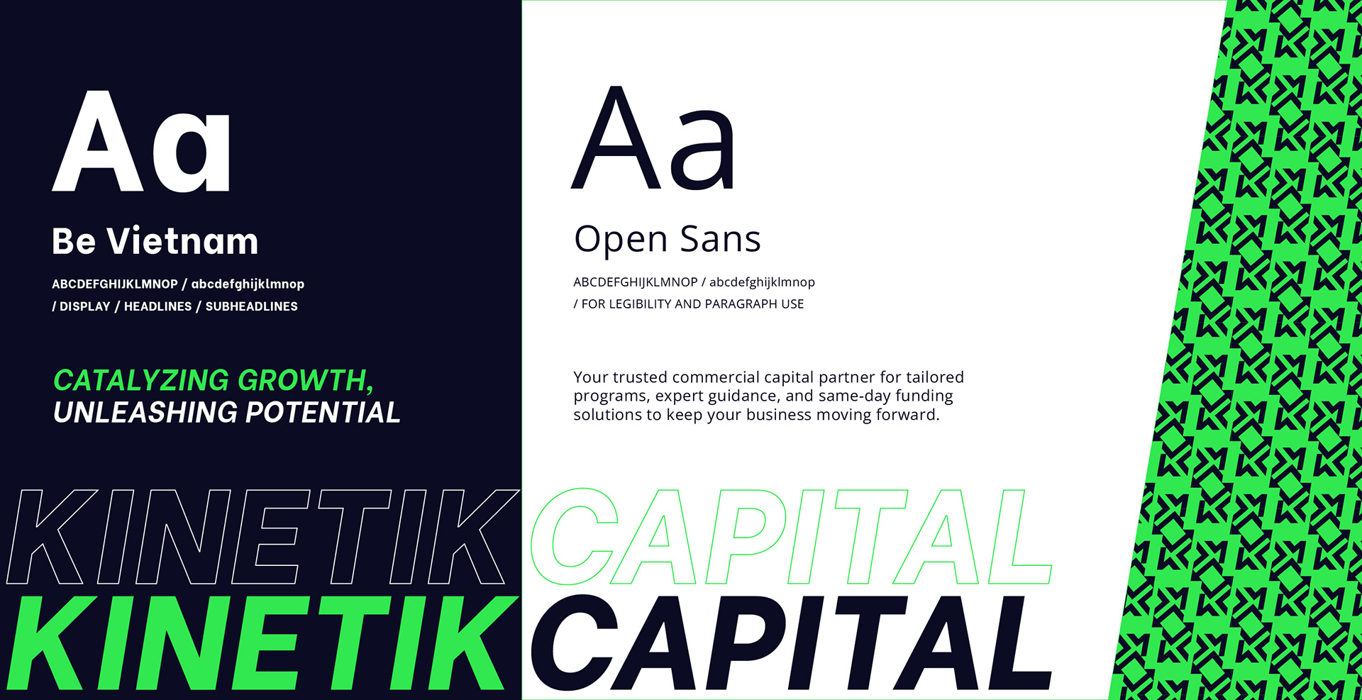
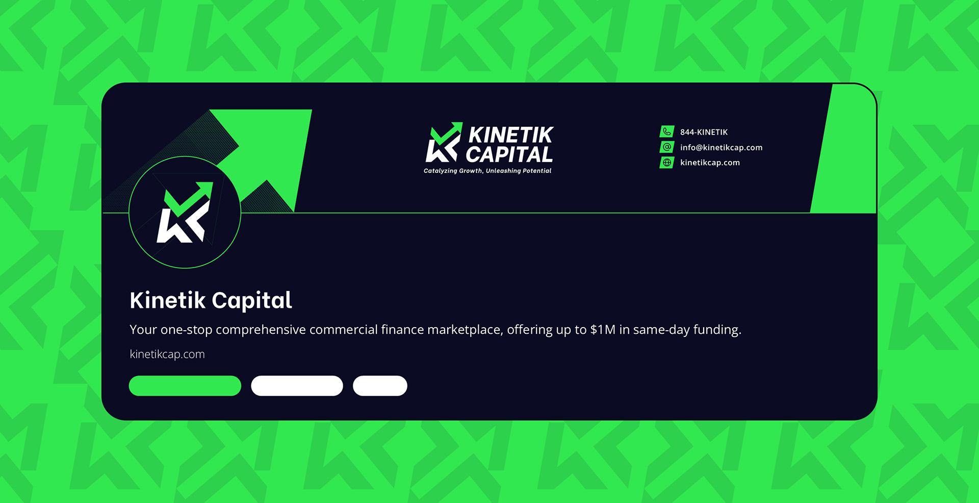
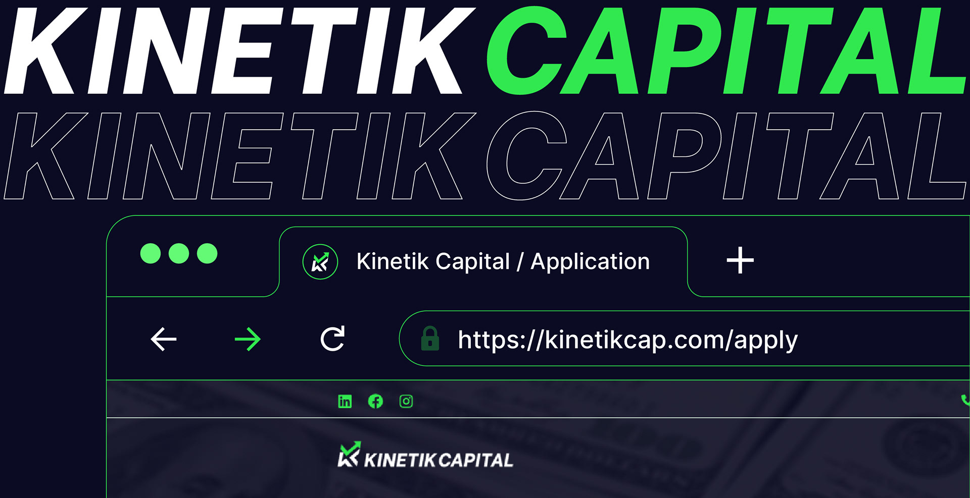
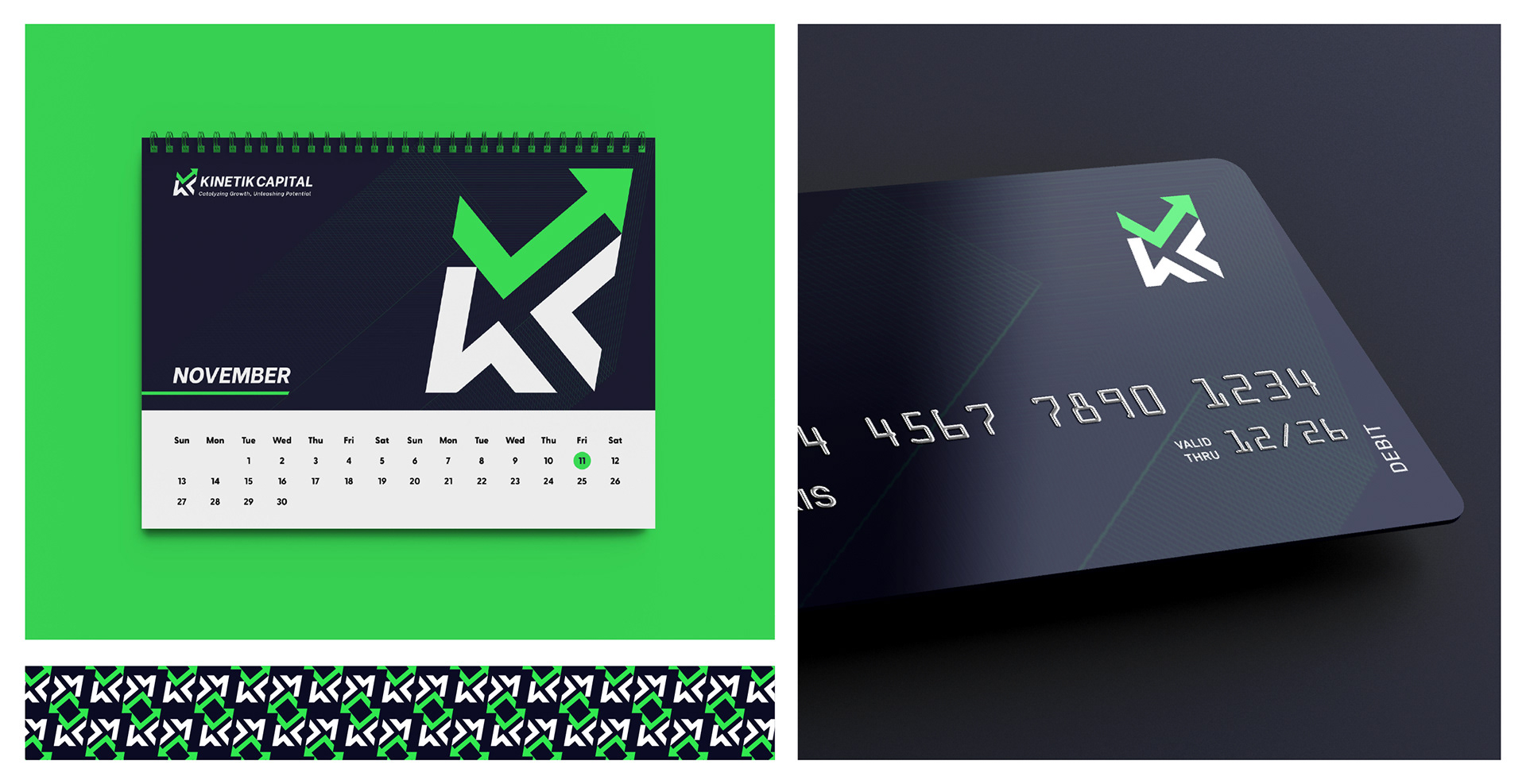
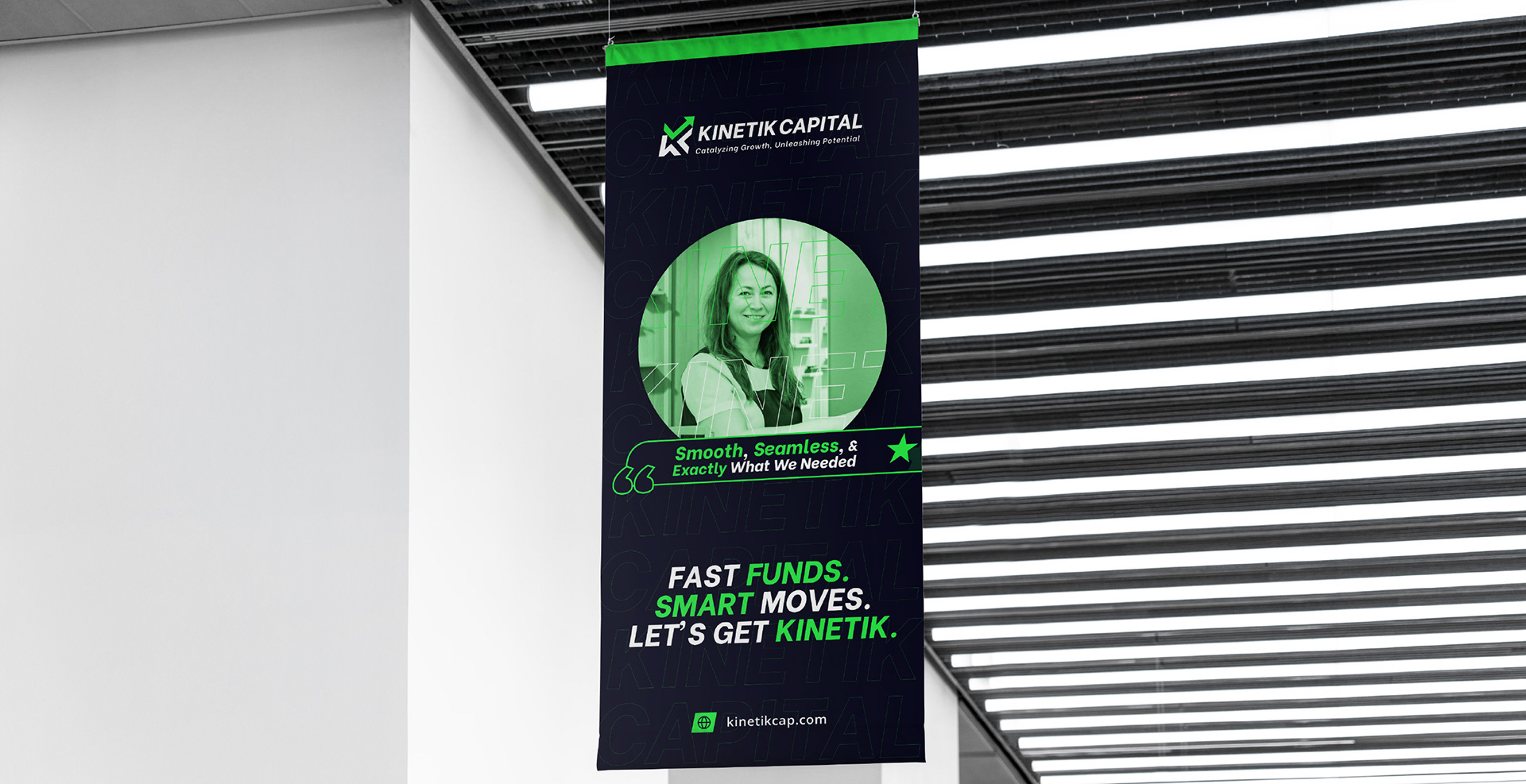
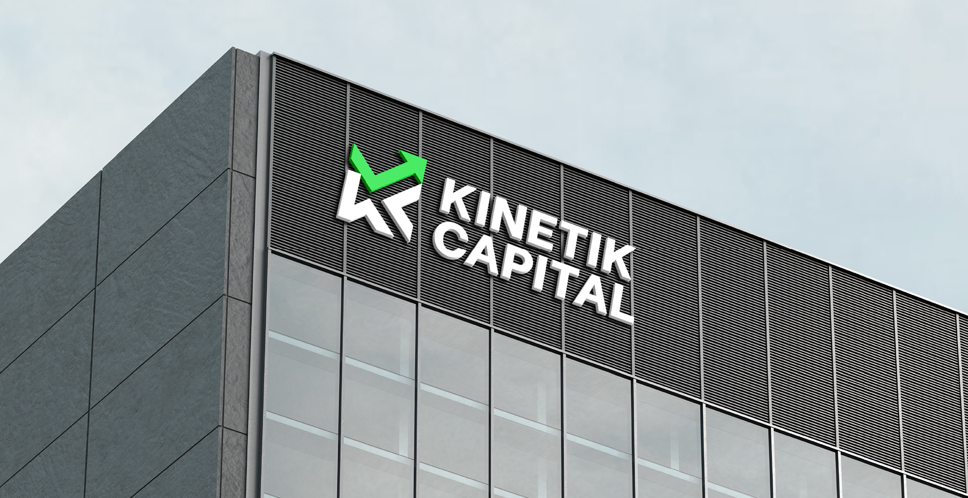
From concept to execution, the brand identity was crafted to reflect movement and empowerment. The logomark combines the initials “K” and “C” with visual cues (arrow and checkmark) symbolizing secured capital, momentum, and approval. The color palette uses rich black and vibrant lime green to balance trust, innovation, and energy. Typefaces like Be Vietnam and Open Sans were carefully chosen for a bold digital presence and easy scalability.
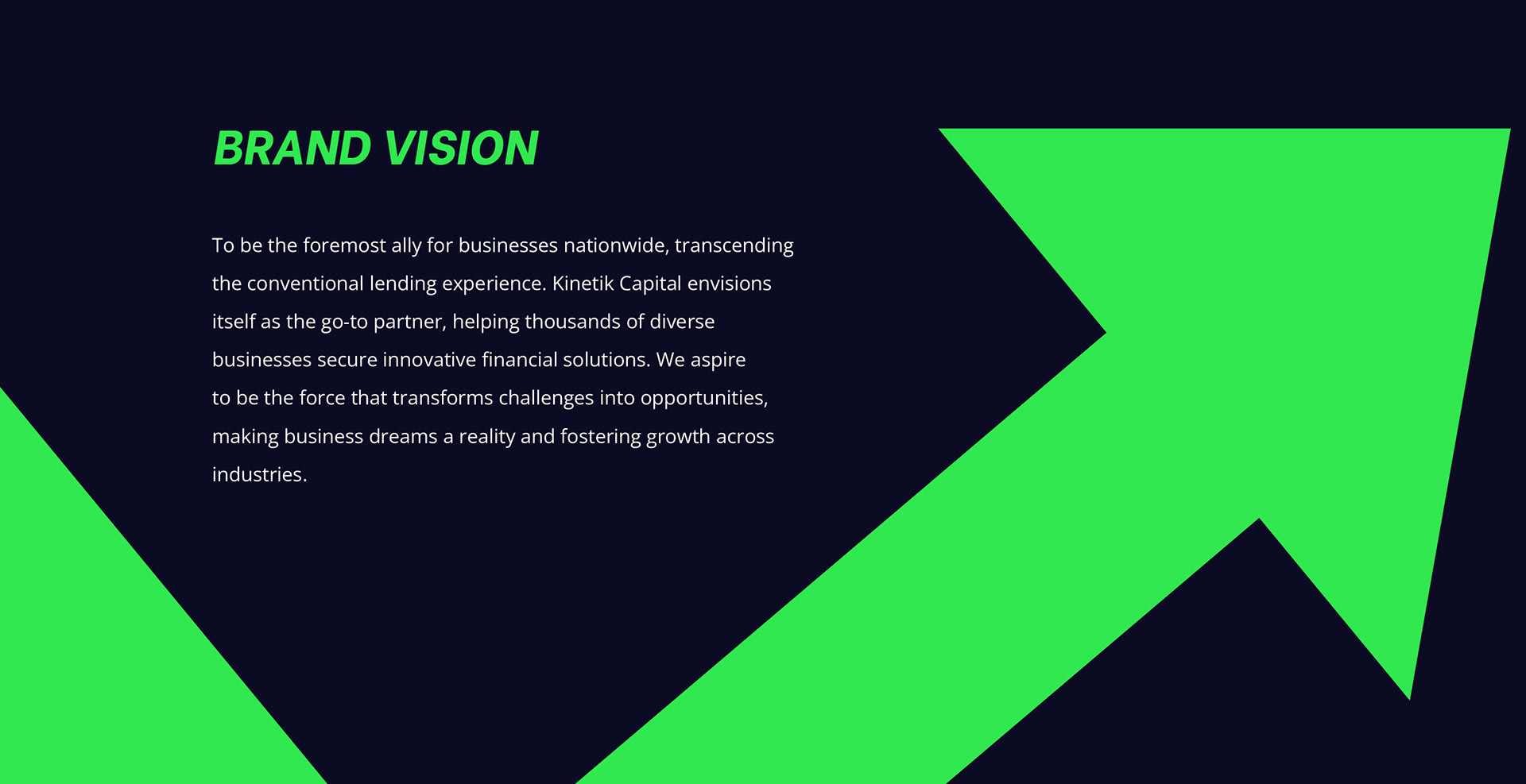
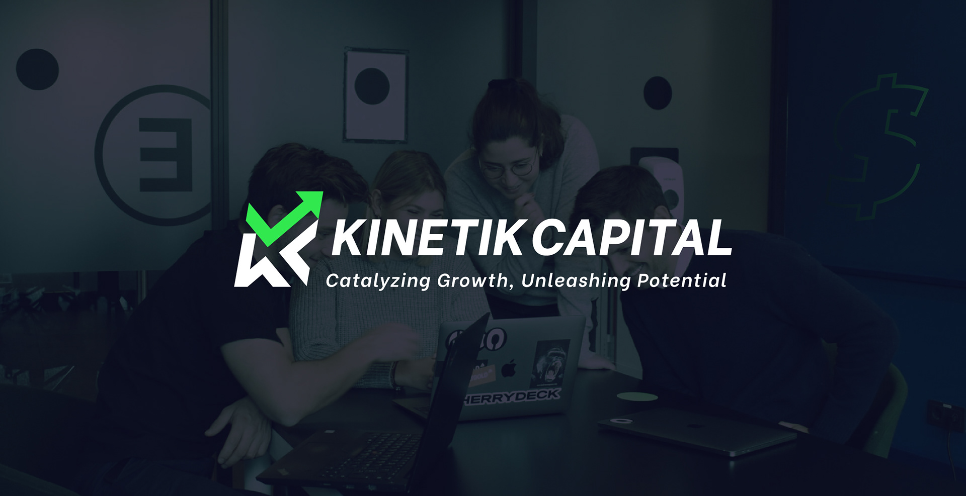
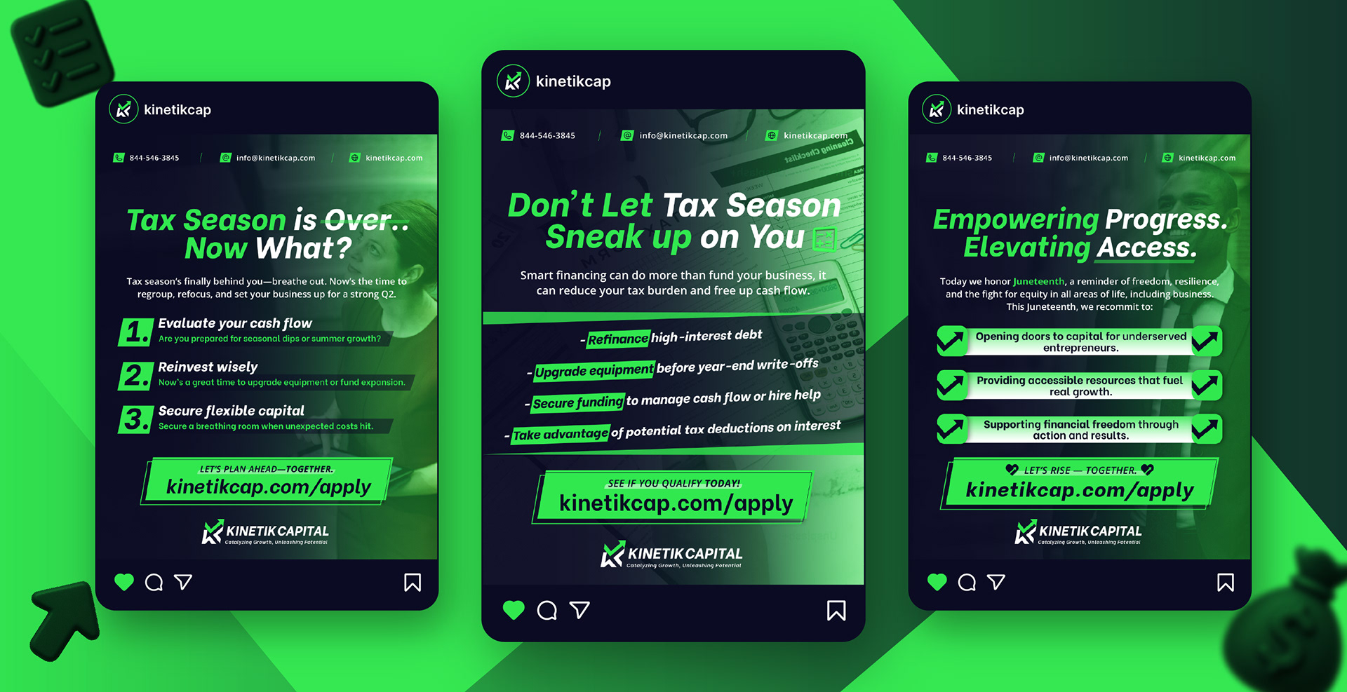
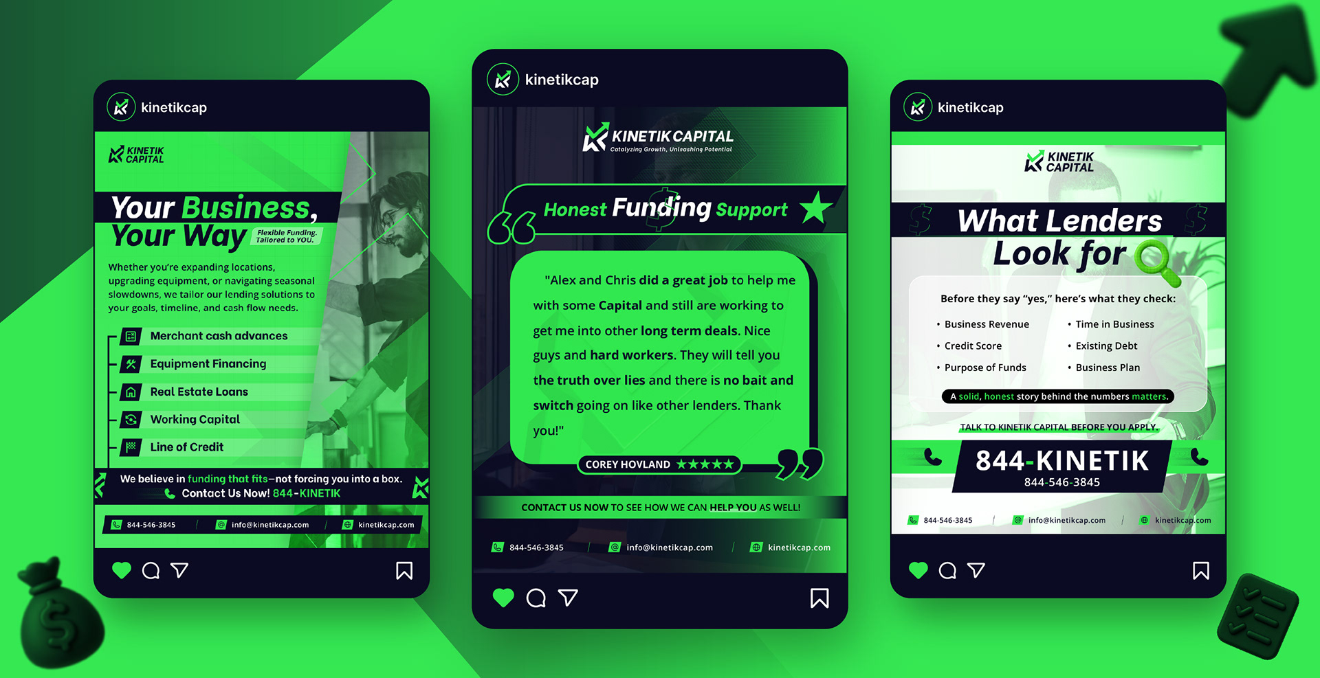
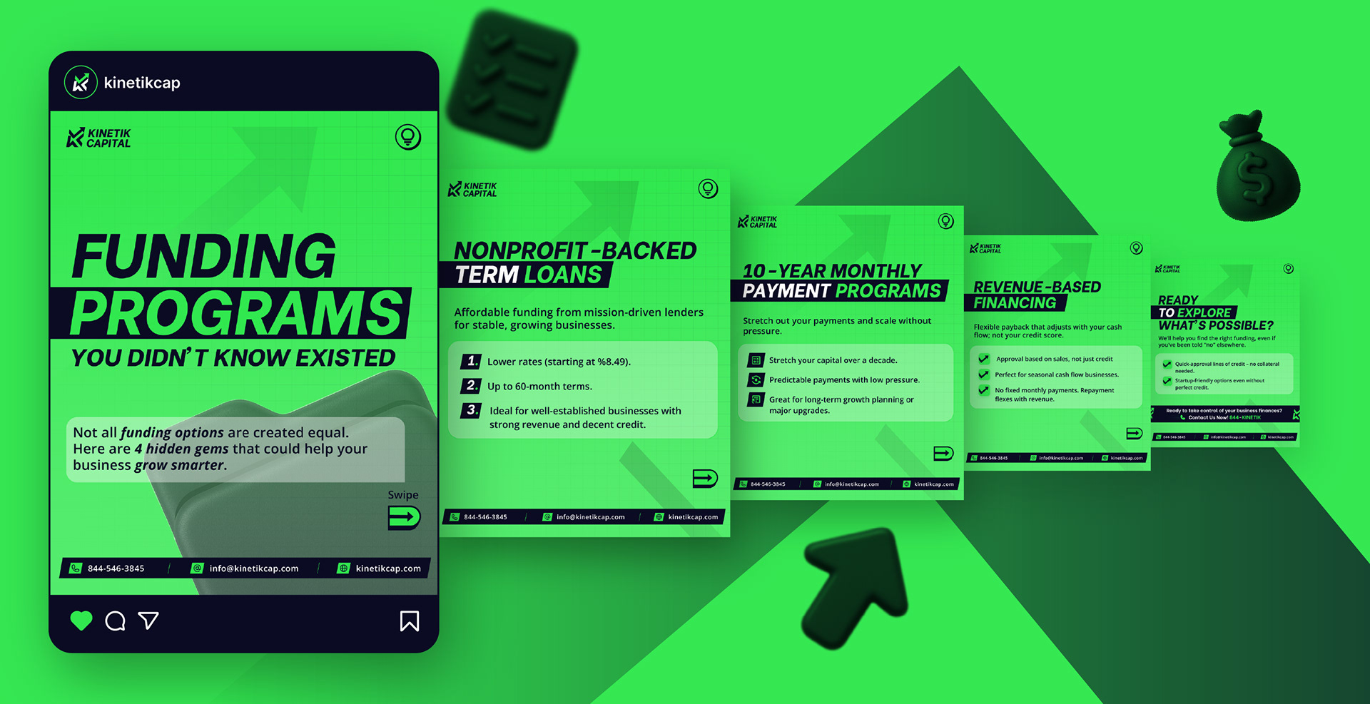
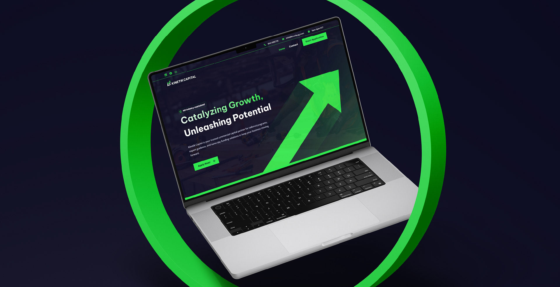
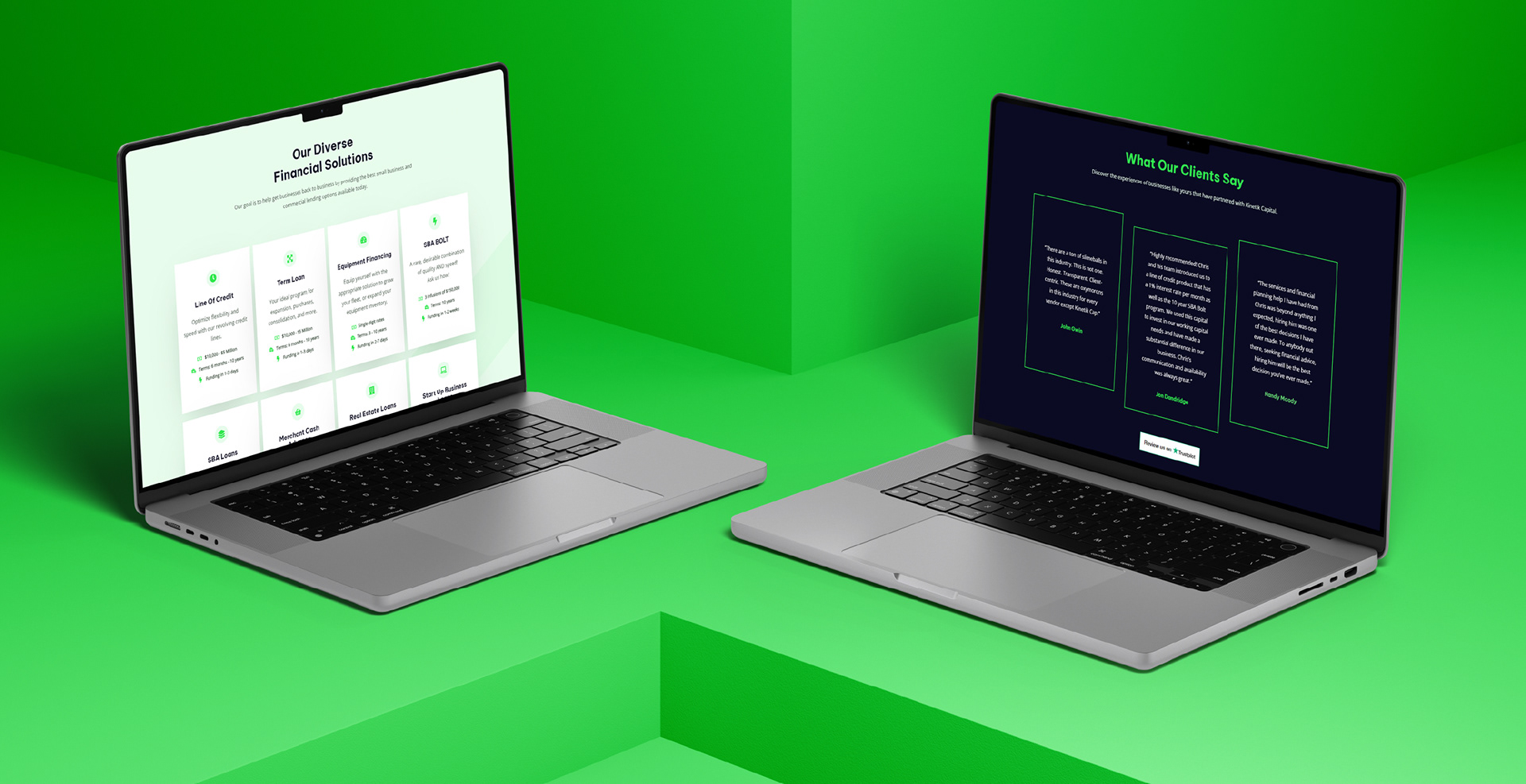
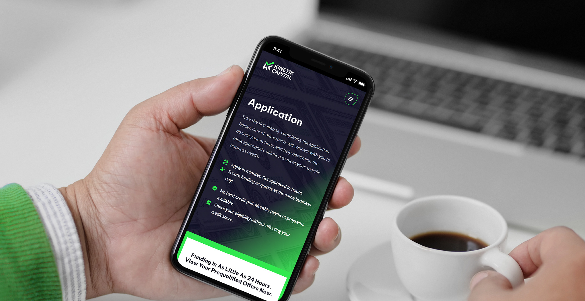
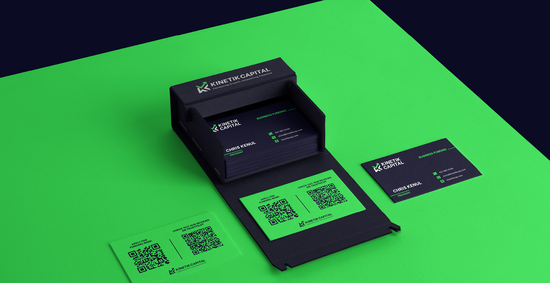
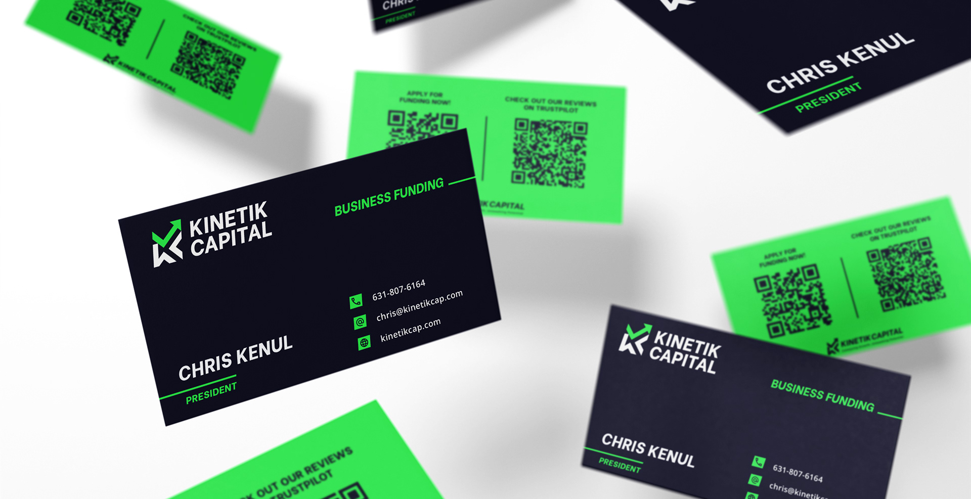
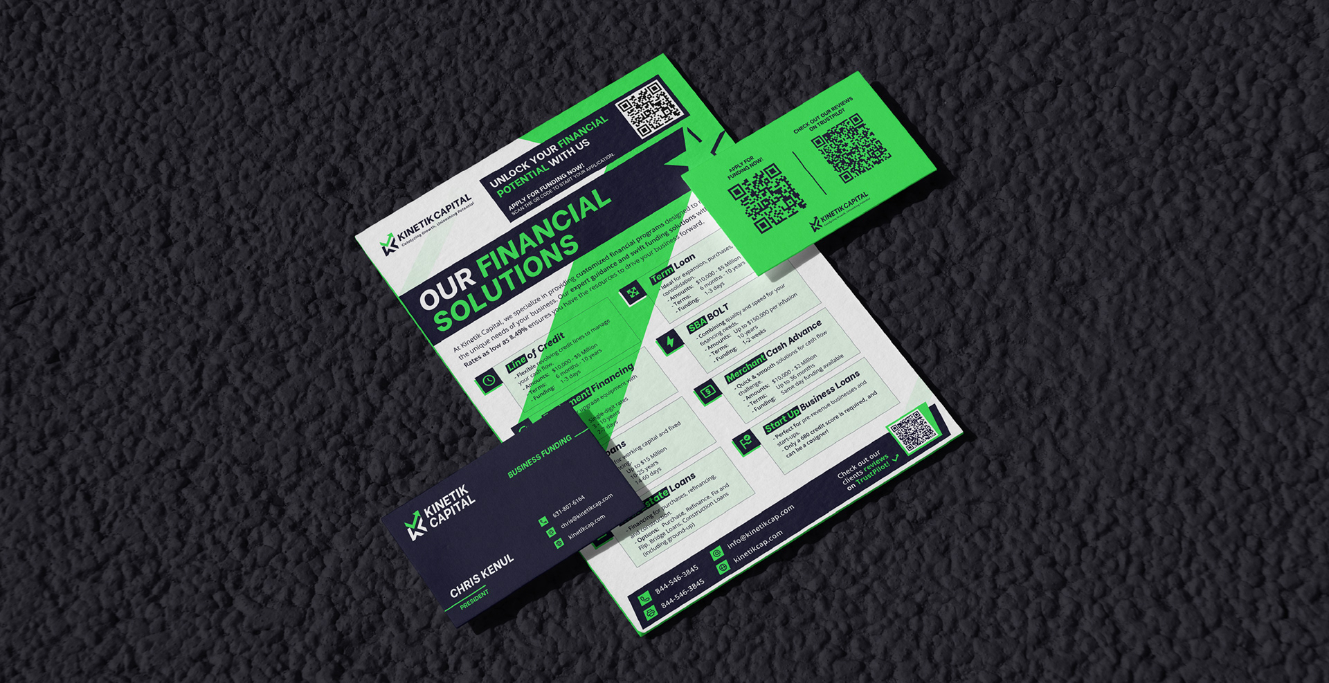
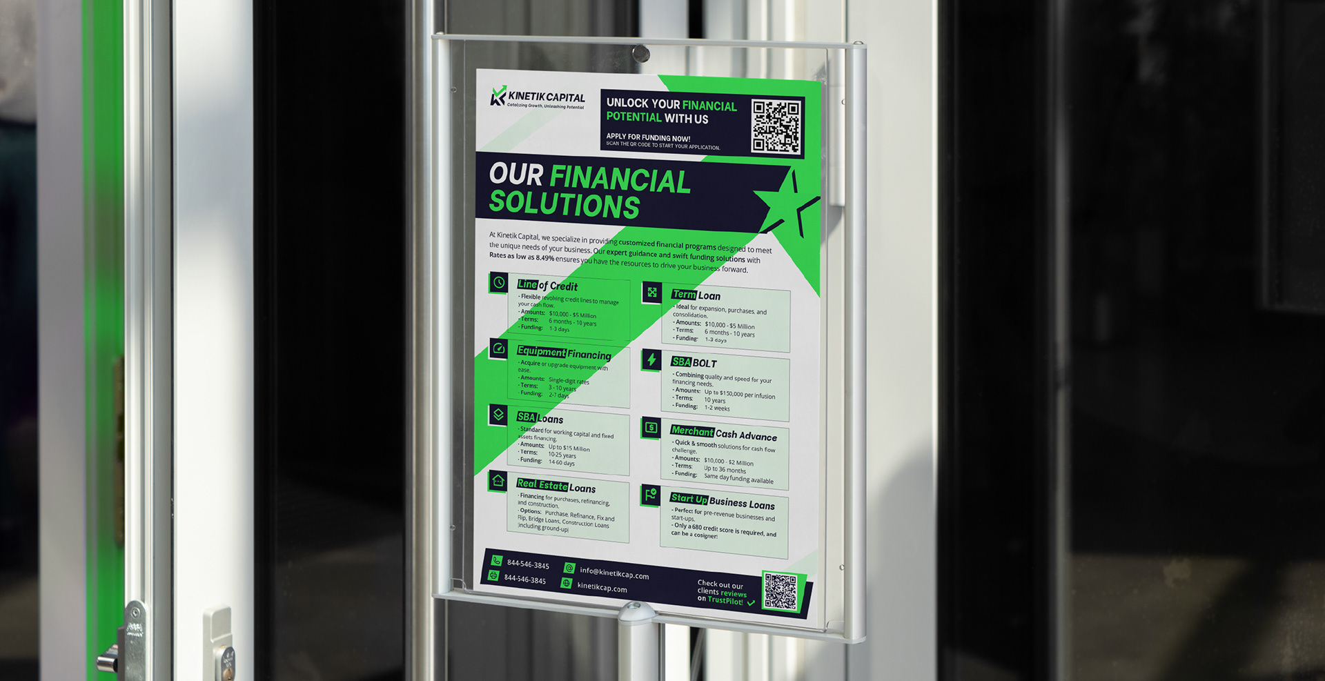
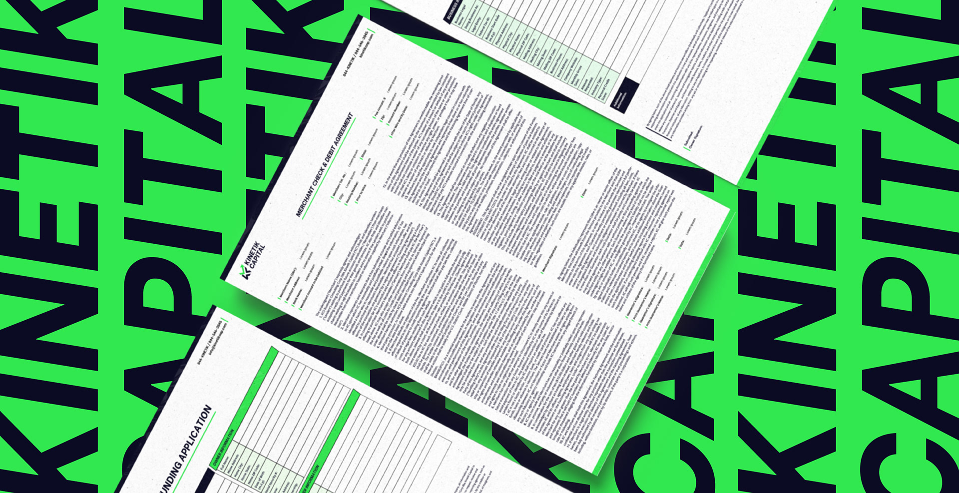
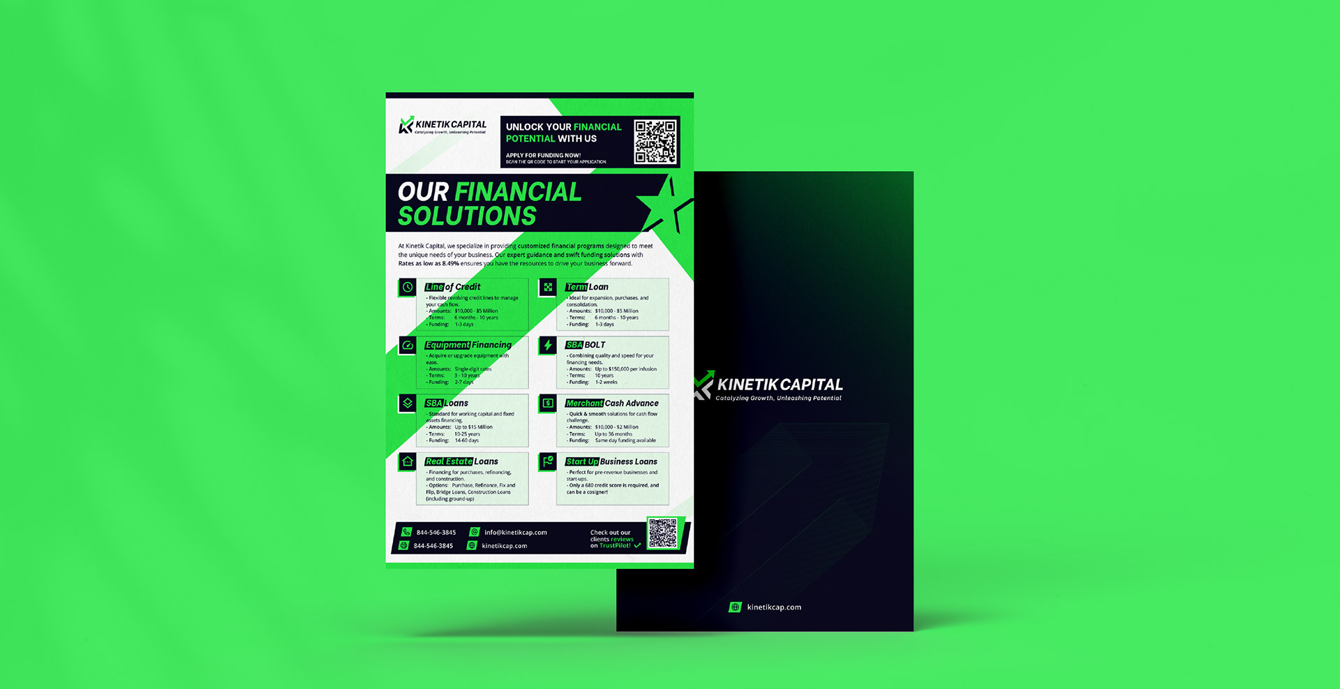
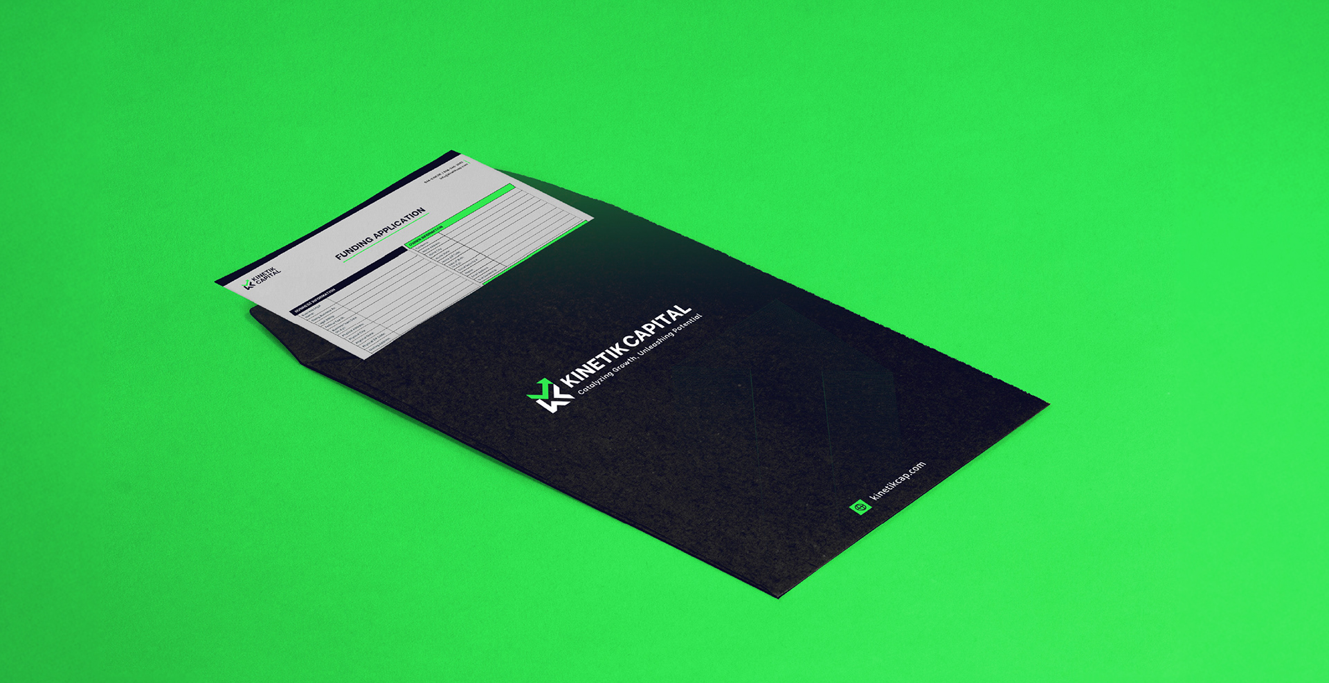
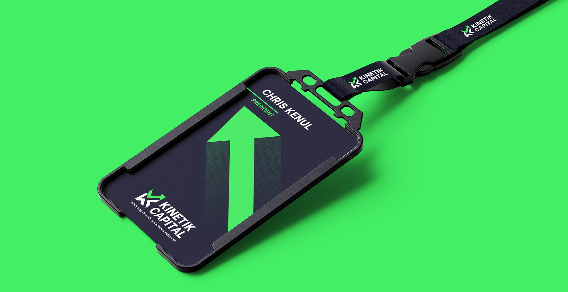
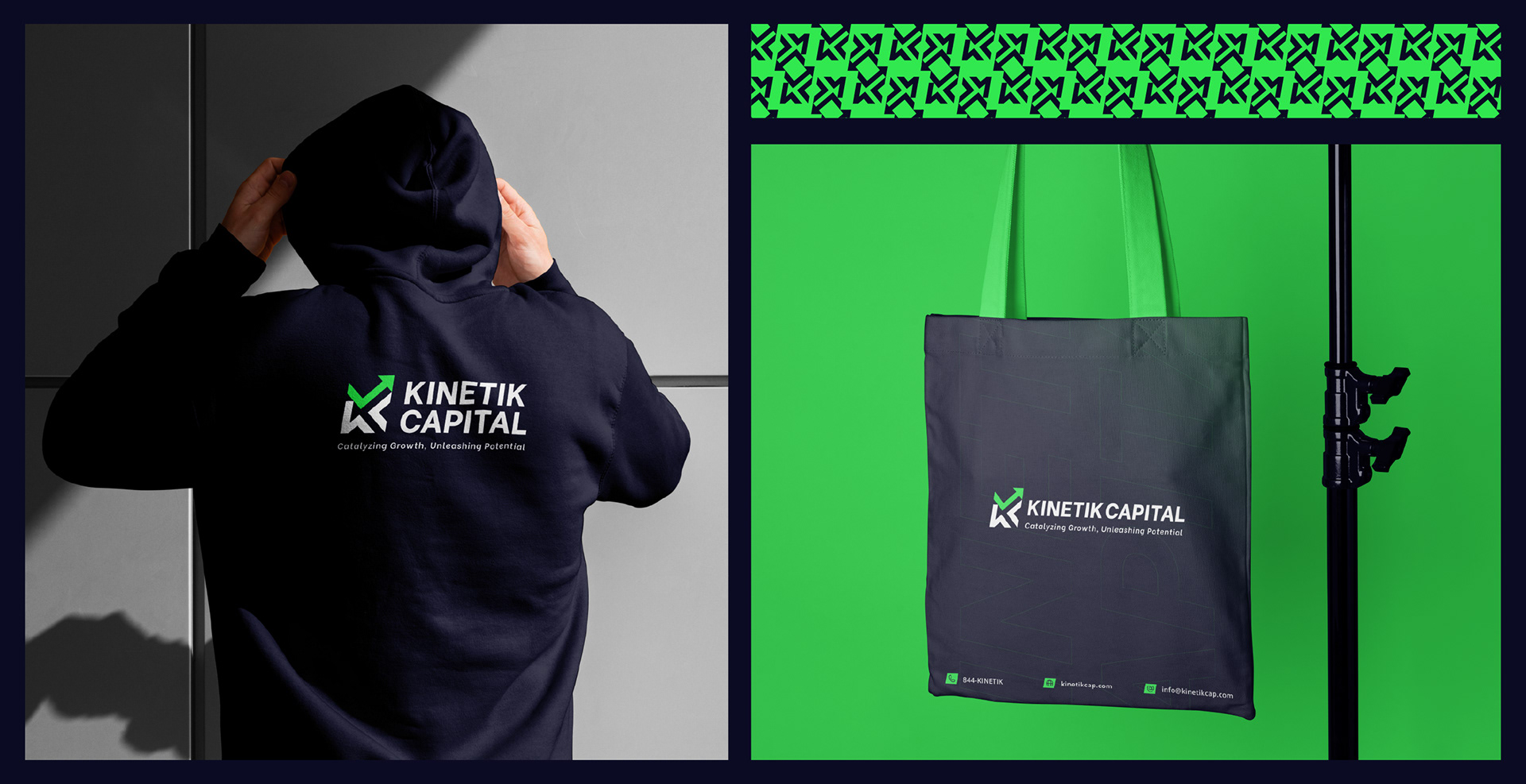
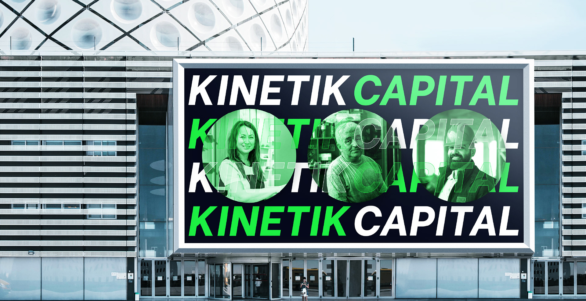
The final result is a system that performs across every touchpoint, from business stationery, application docs, landing pages, flyers to social media content. The brand's visual identity present it to its clients as a growth partner and expresses confidence backed with integrity, clarity without cliché, and agility without chaos.
| INDUSTRY
Business Funding
Business Funding
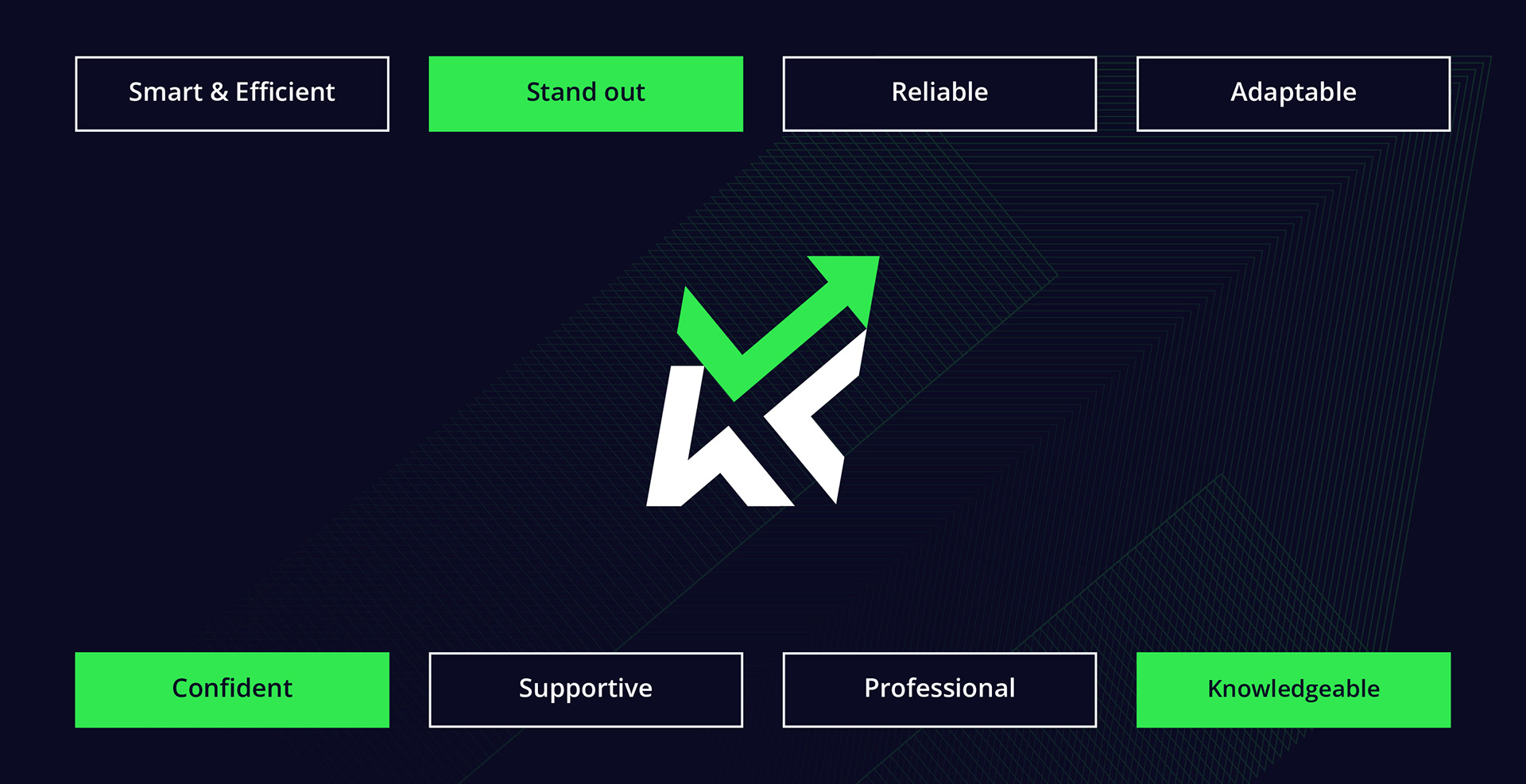
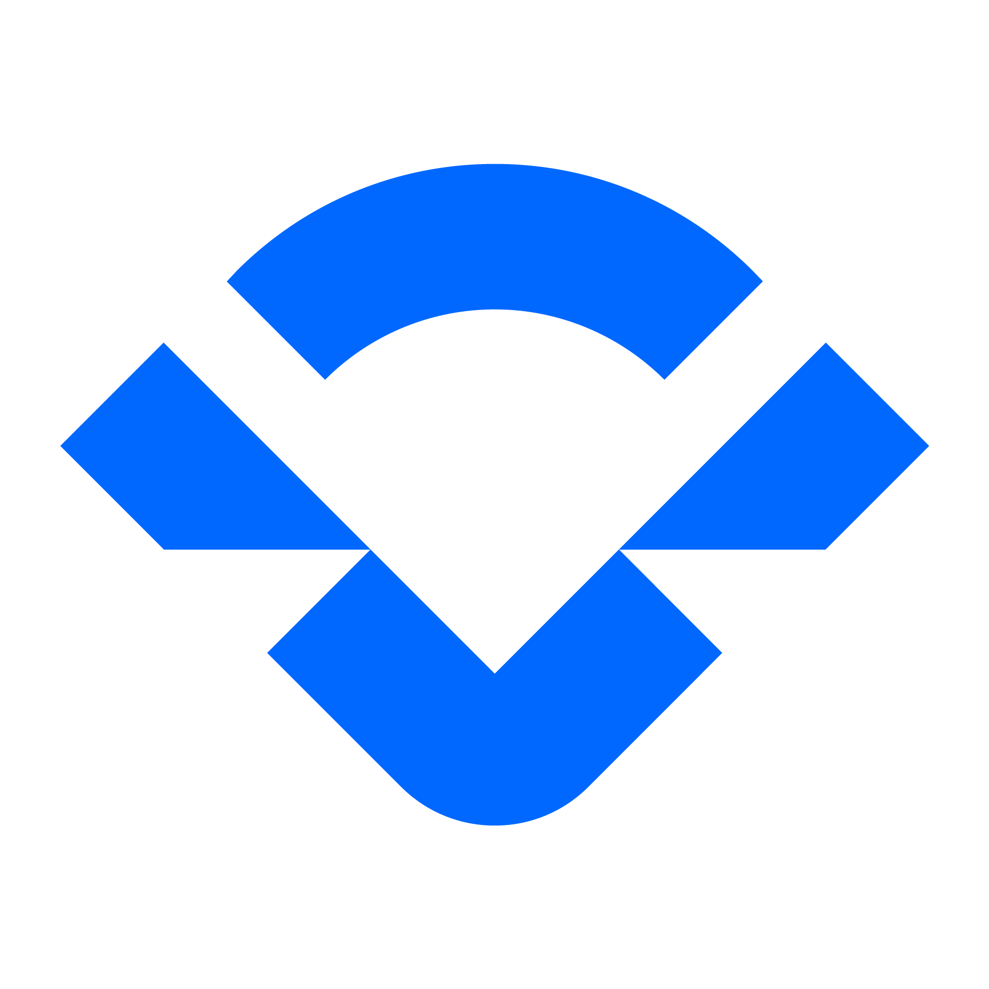
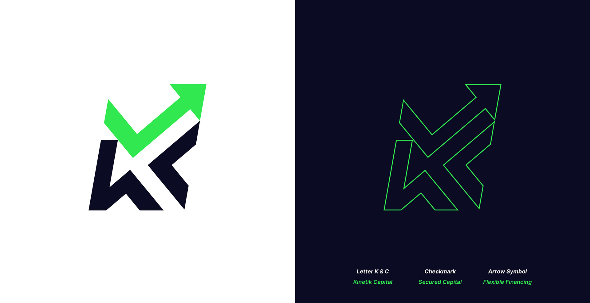
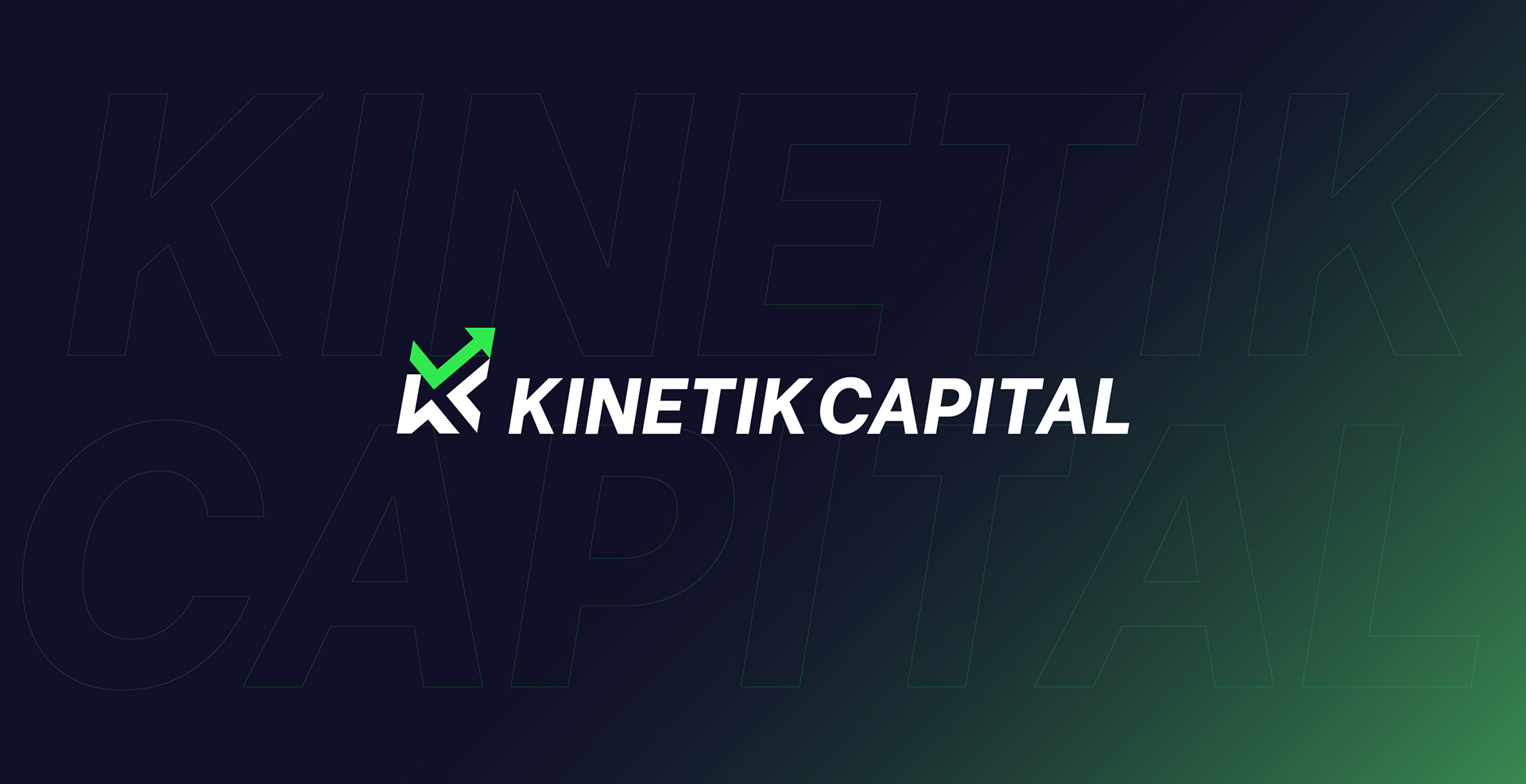
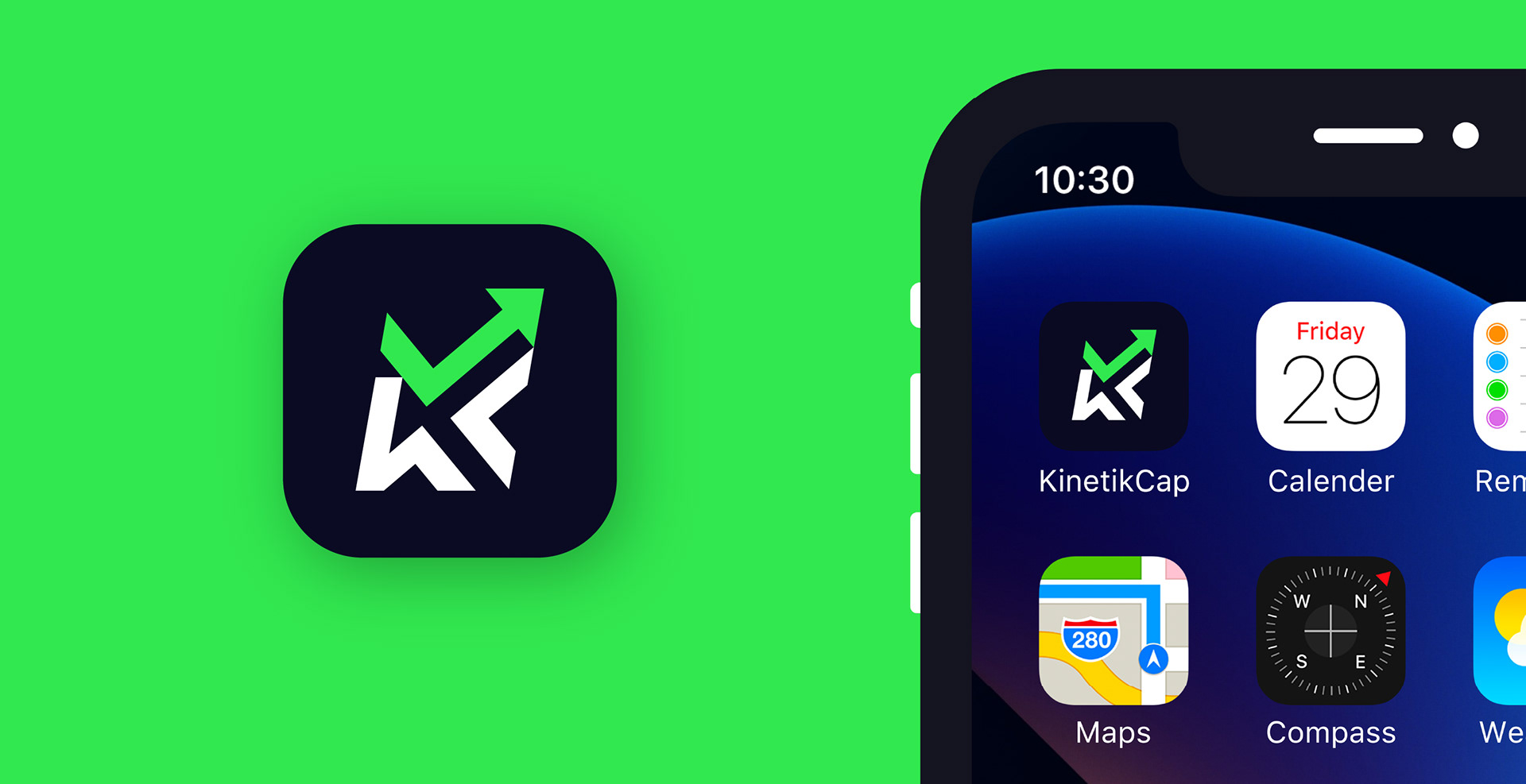
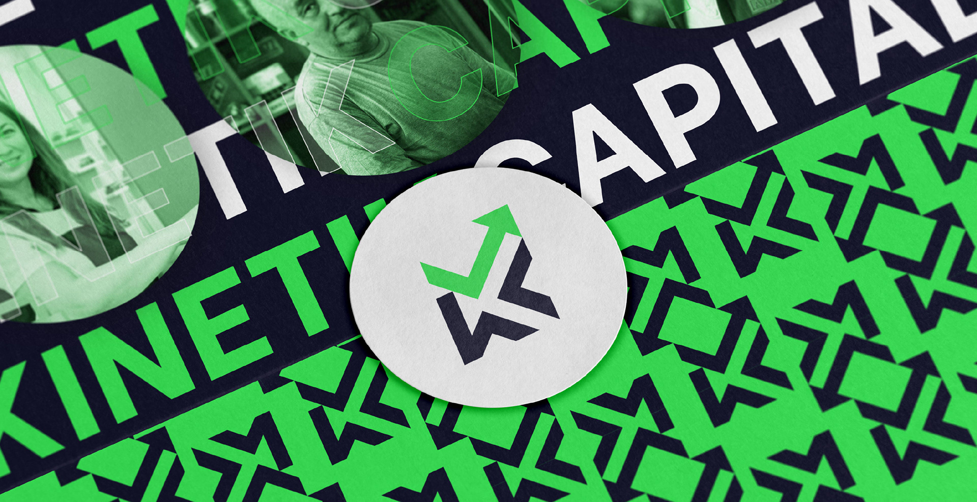
Kinetik Capital's logomark merges strategy and symbolism in a clean, scalable system.
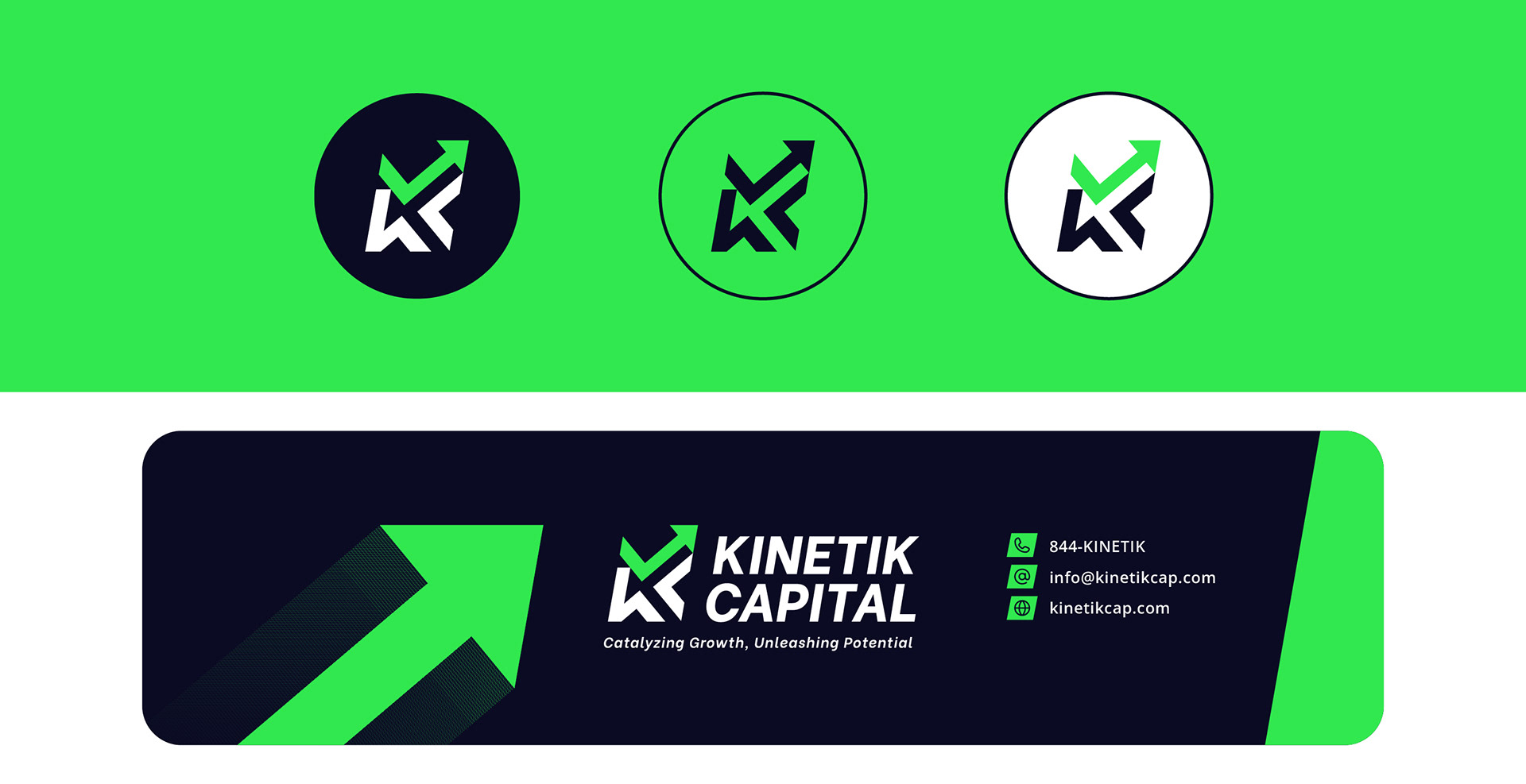
At its core, the symbol fuses the letters K and C, subtly integrating a checkmark (approval) and arrow (momentum). This fusion reflects Kinetik’s mission: secure capital, flexible direction, and fast action.
The mark was designed to feel strong yet adaptable. It works across web, app icons, and social profiles without losing legibility or impact.
Logo Elements:
- Letterforms: K + C
- Checkmark: Sign of approval and verified success
- Arrow: Momentum, progress, and future growth
- Geometric construction: Clean lines for precision and trust
The result is a symbol that feels modern, sharp, and innately tied to the idea of movement; perfect for a brand built on speed and scalability.
✲ Want to work with us? Click Here
Contact us today to elevate your brand!
-------------
✲ Let's connect: