
| Branding Case Study
SmartyOps // HvBrands® -2024
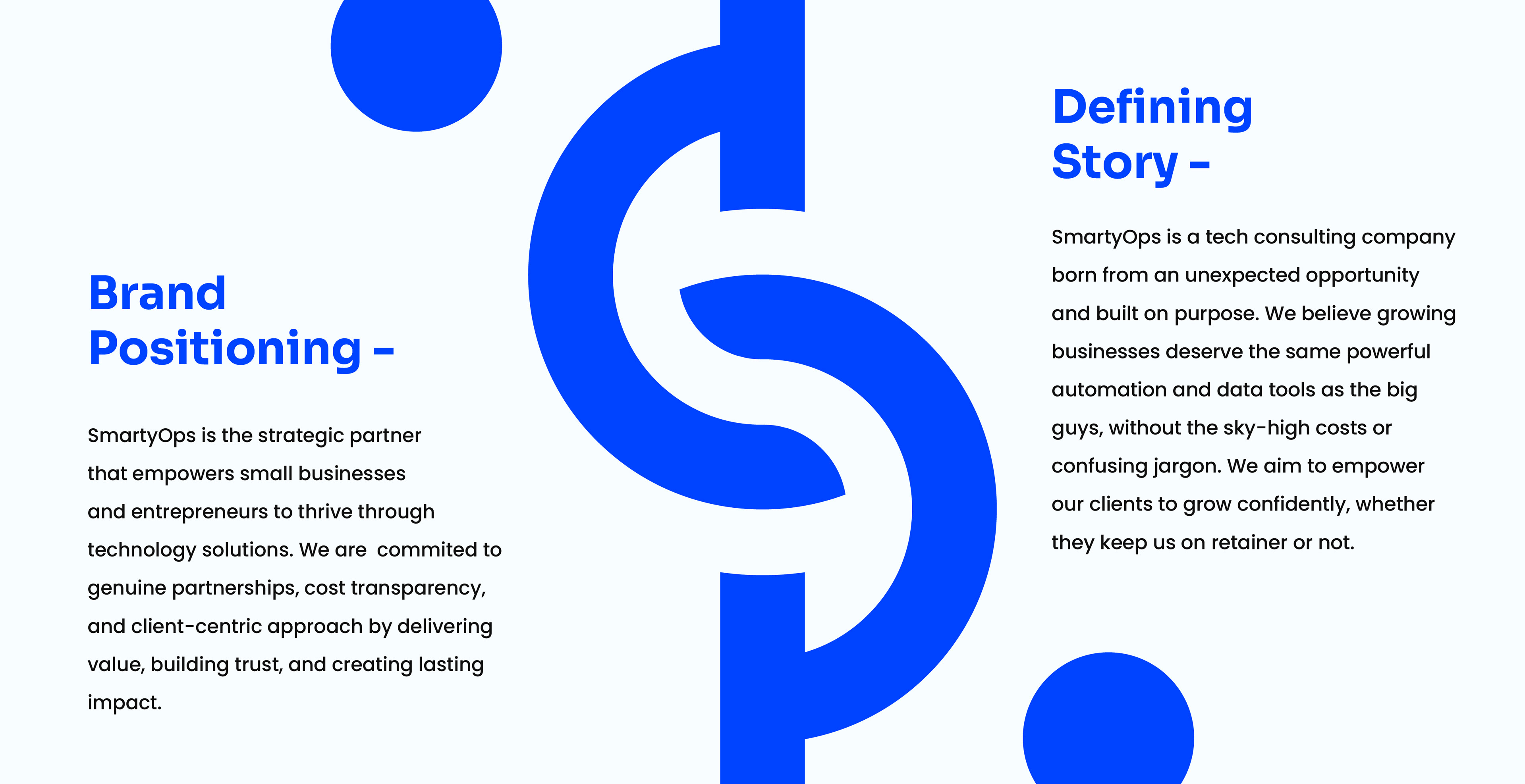
SmartyOps is a B2B technology provider focused on empowering small businesses with smart operational solutions. When the founder approached me he had a clear mission: to translate their deeply technical, efficiency-driven offering into a brand identity that felt accessible, modern, trustworthy and innately intelligent.
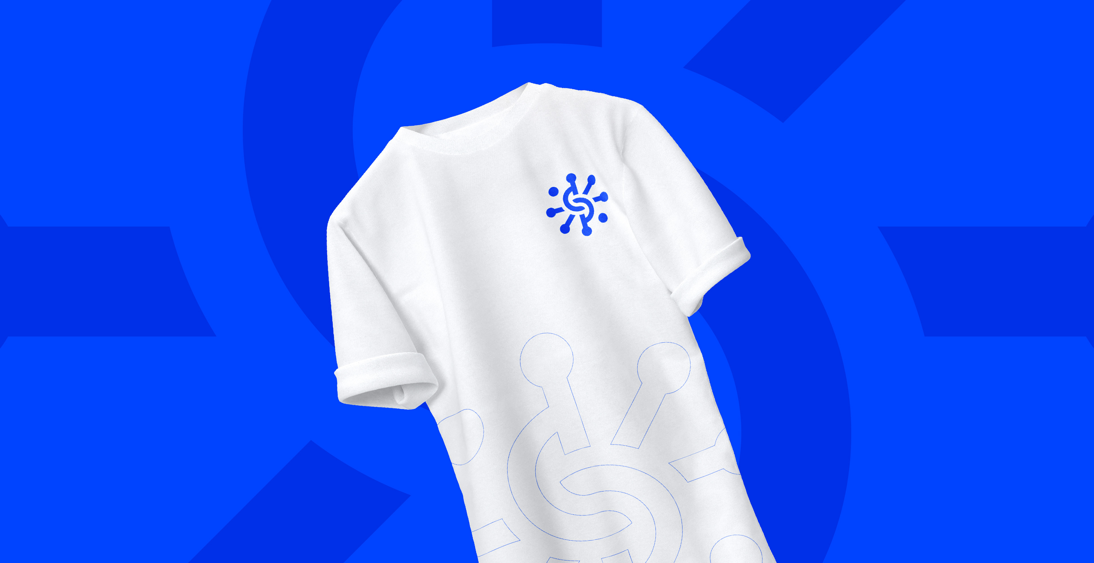
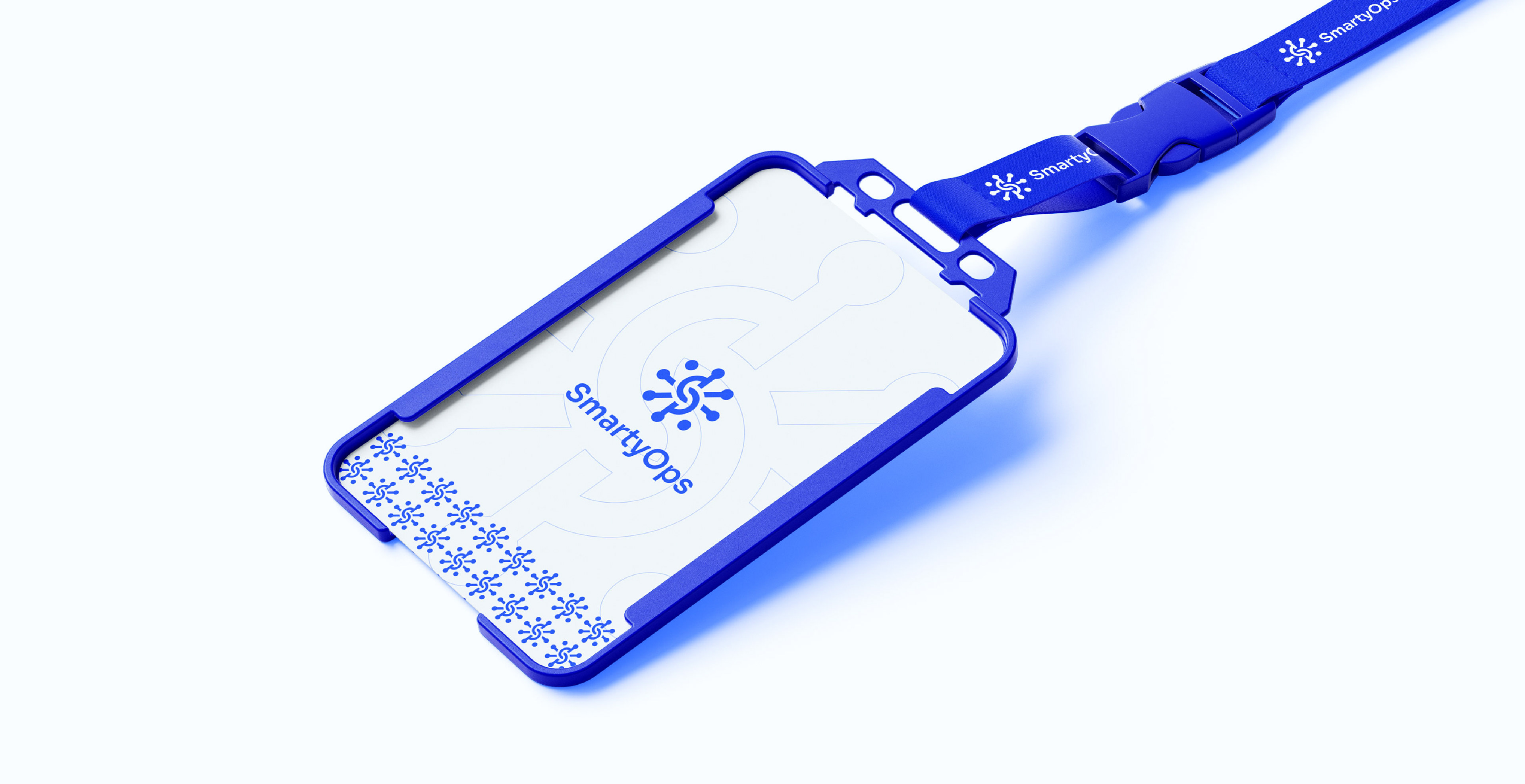
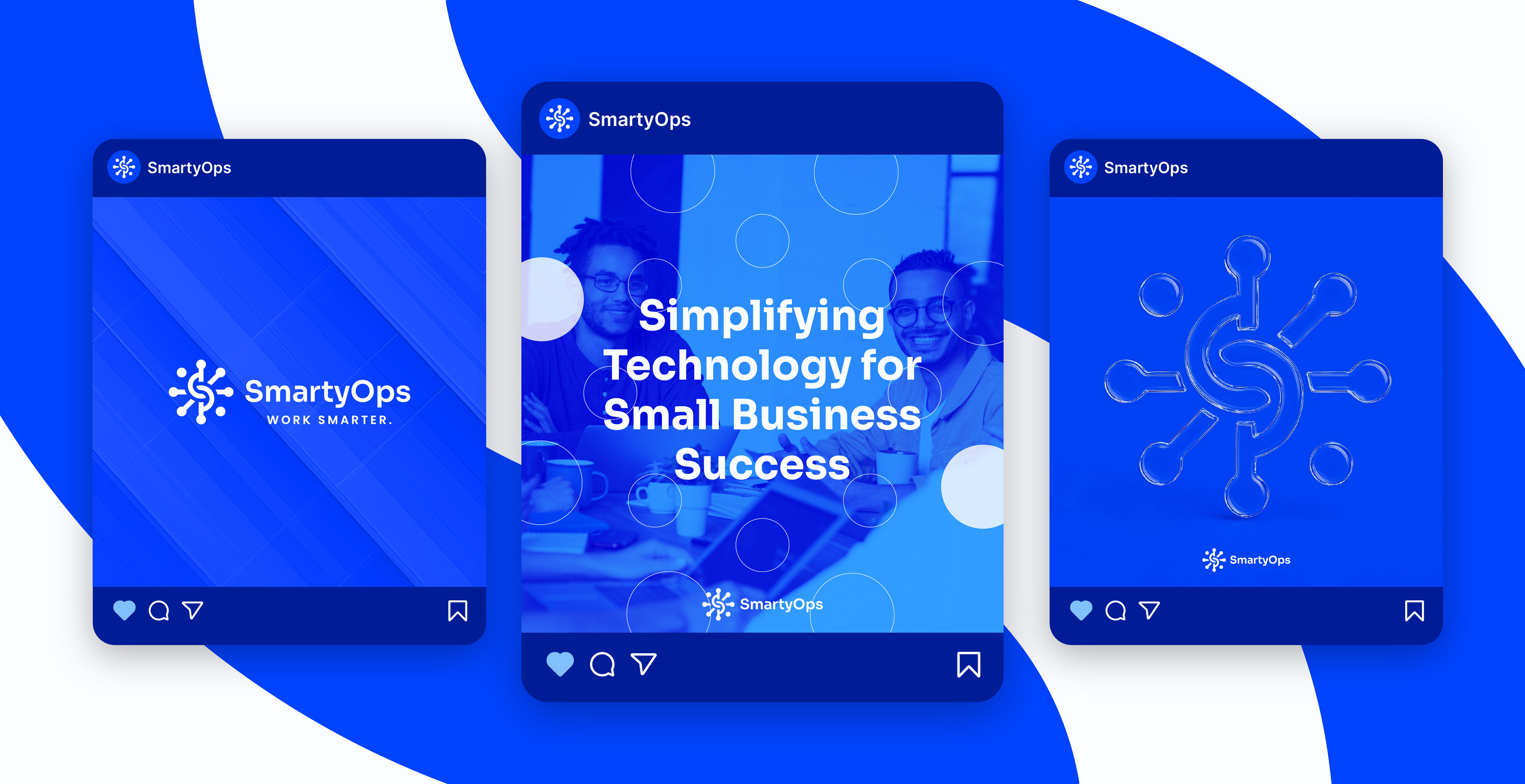
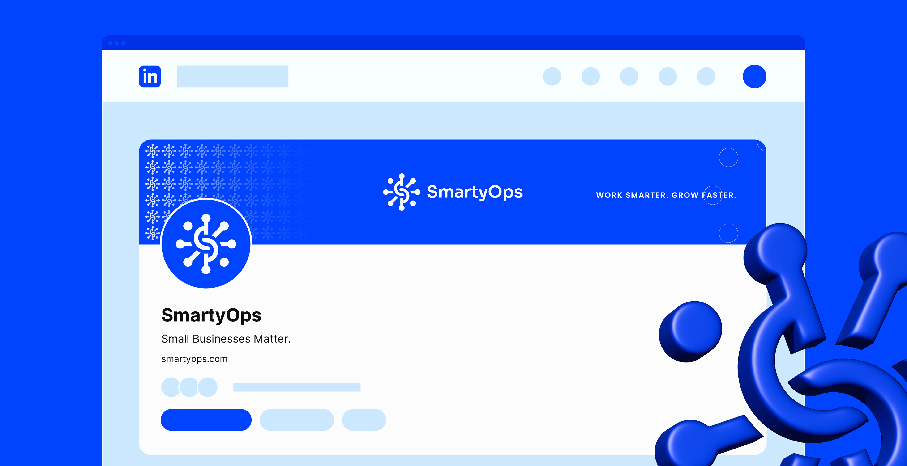
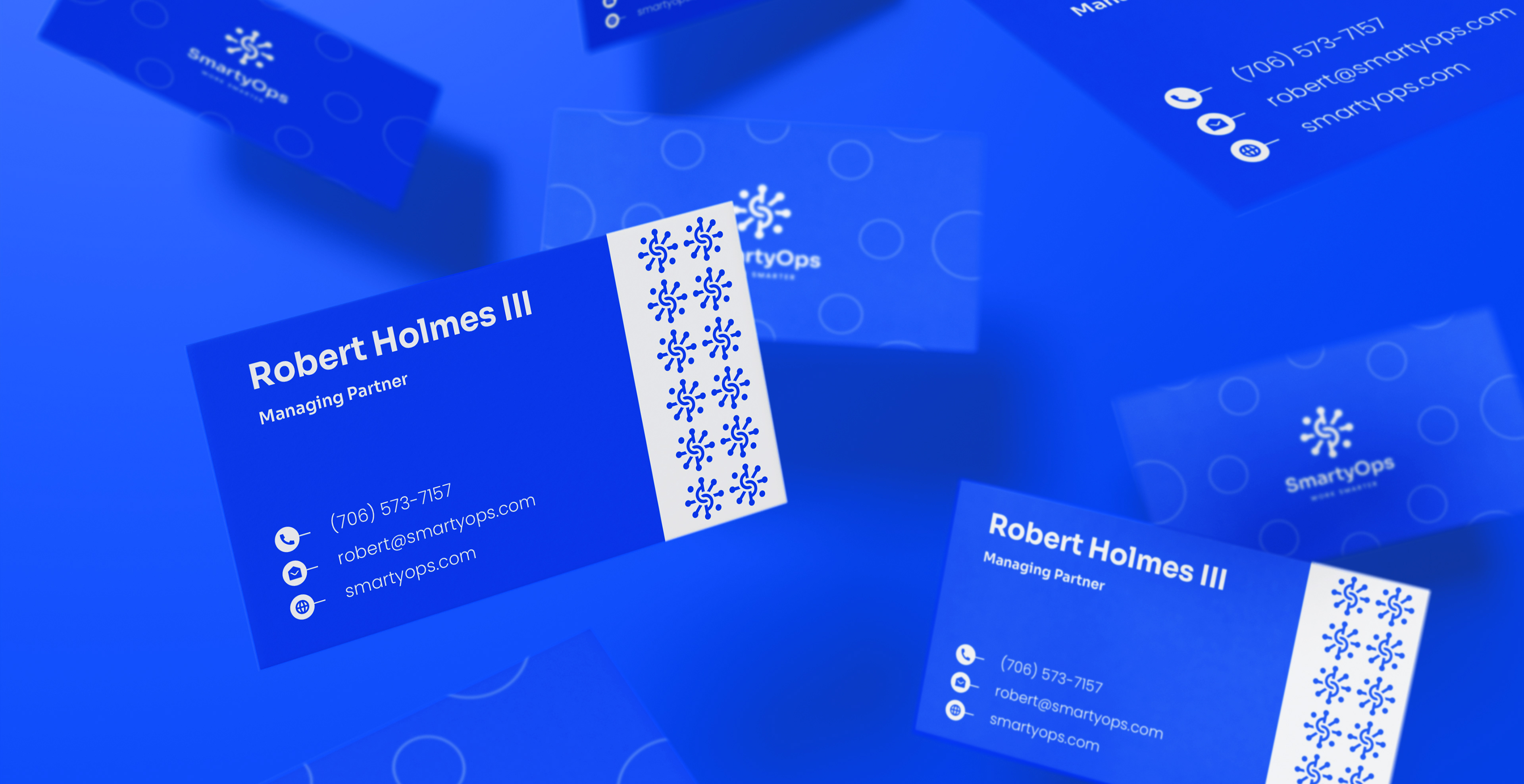
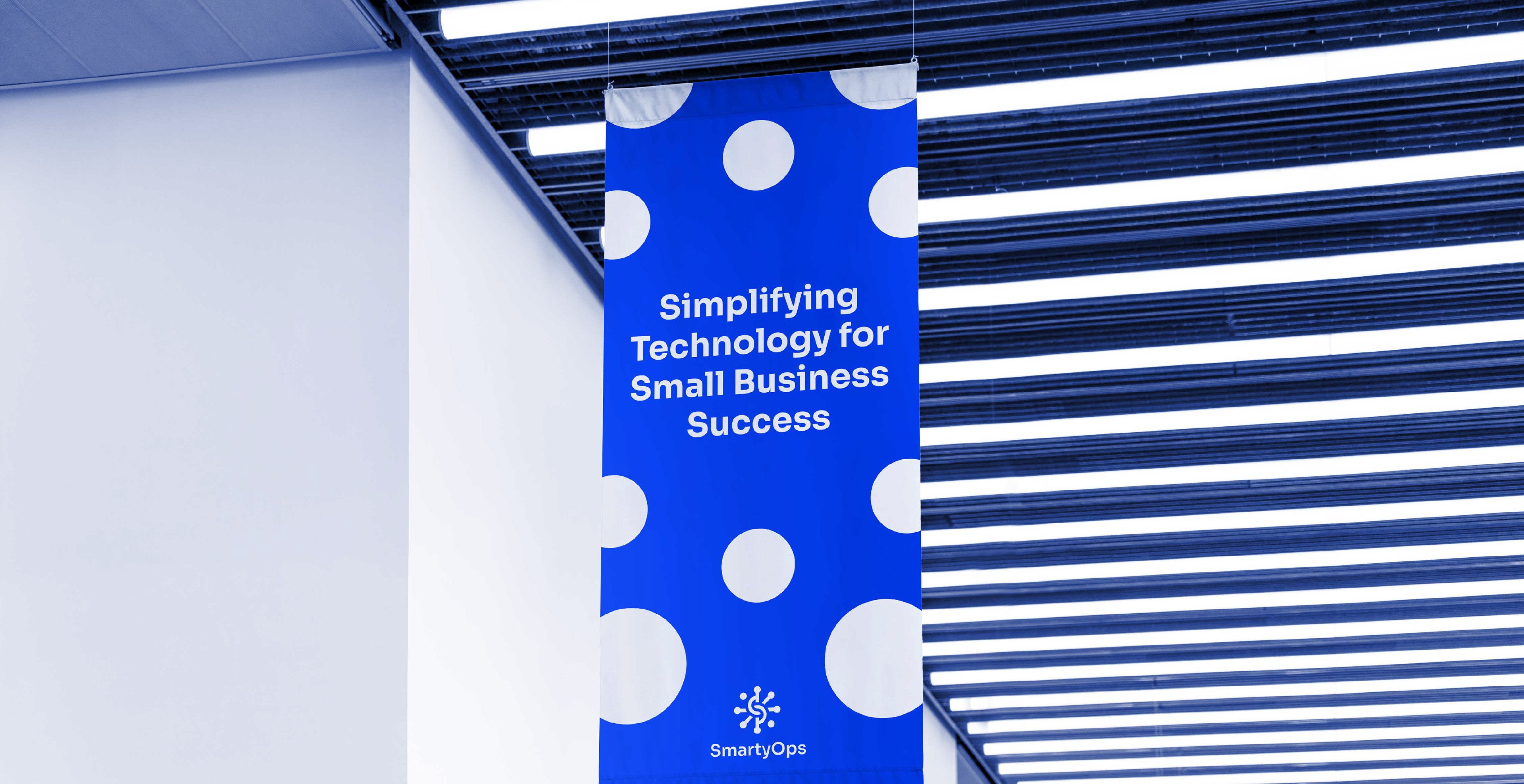
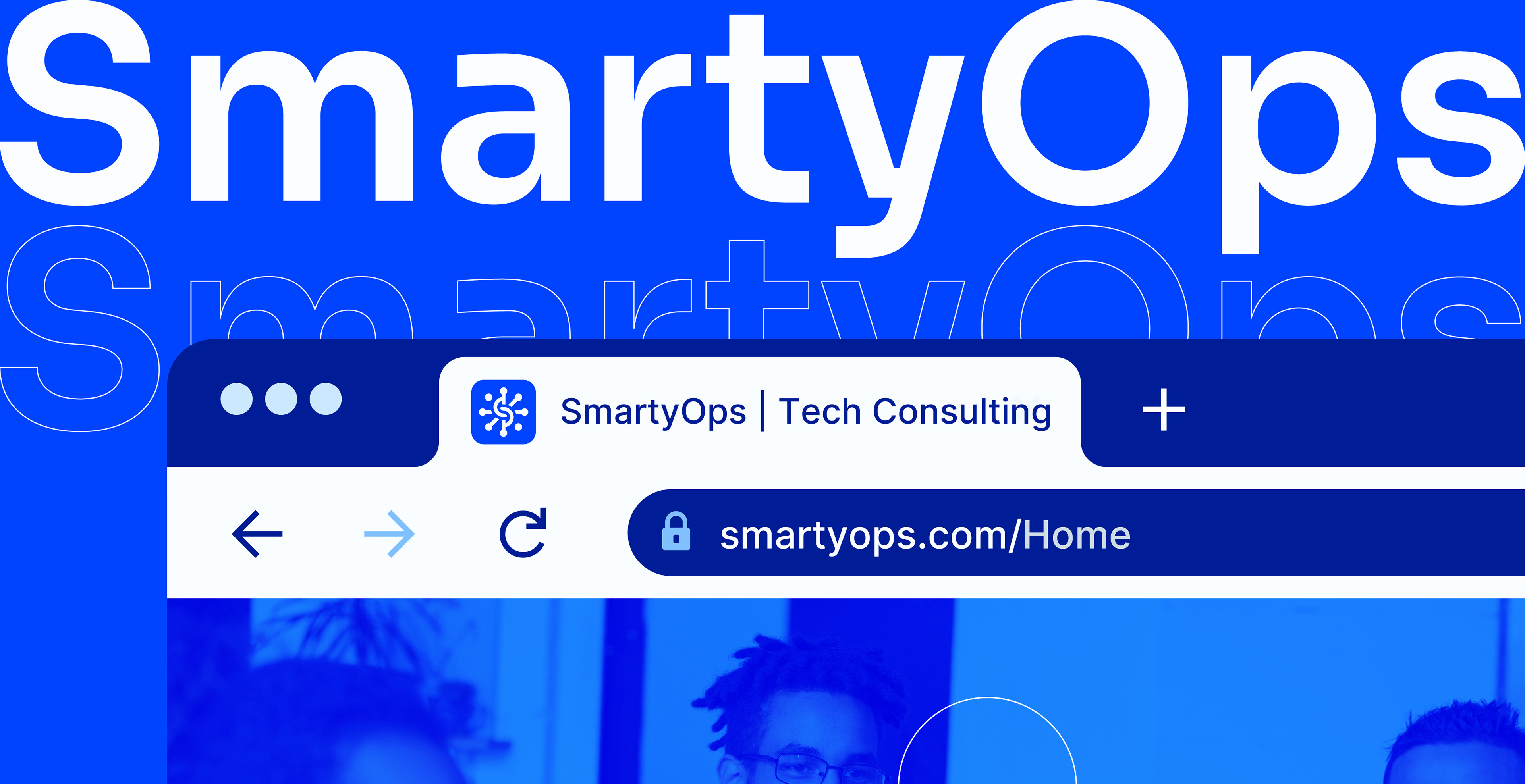
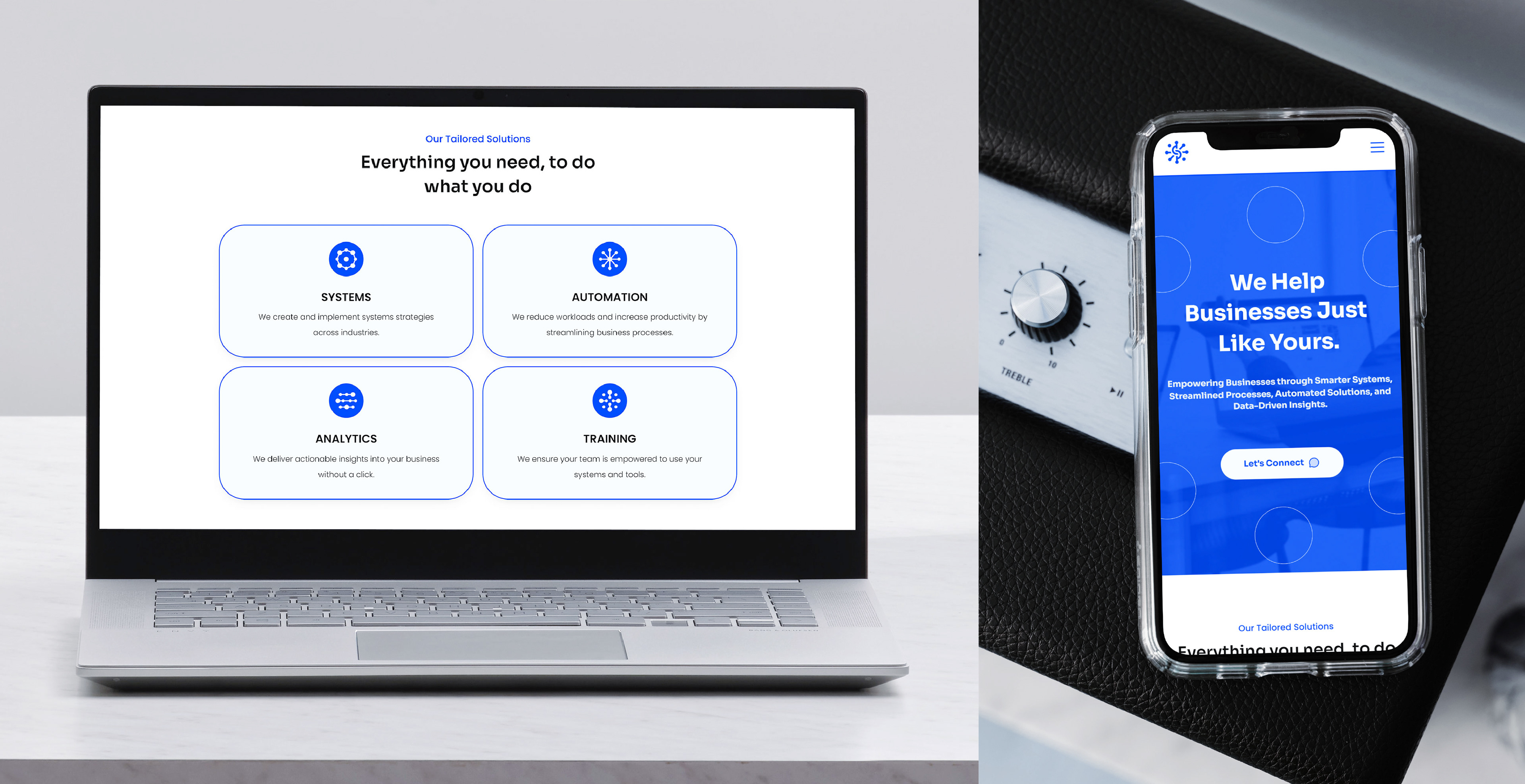
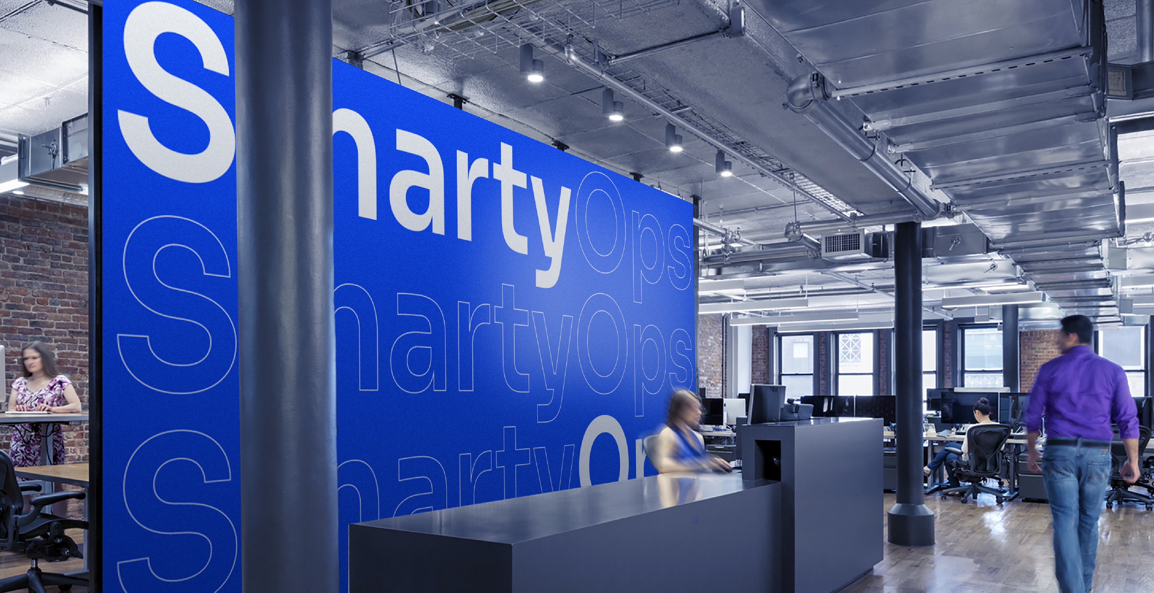
The challenge wasn’t just to look tech-savvy but also to feel human and trustworthy. SmartyOps needed a system that could scale across digital interfaces, socialmedia, pitch decks, digital campaigns, all while reinforcing values of trust, knowledge sharing, and innovation.
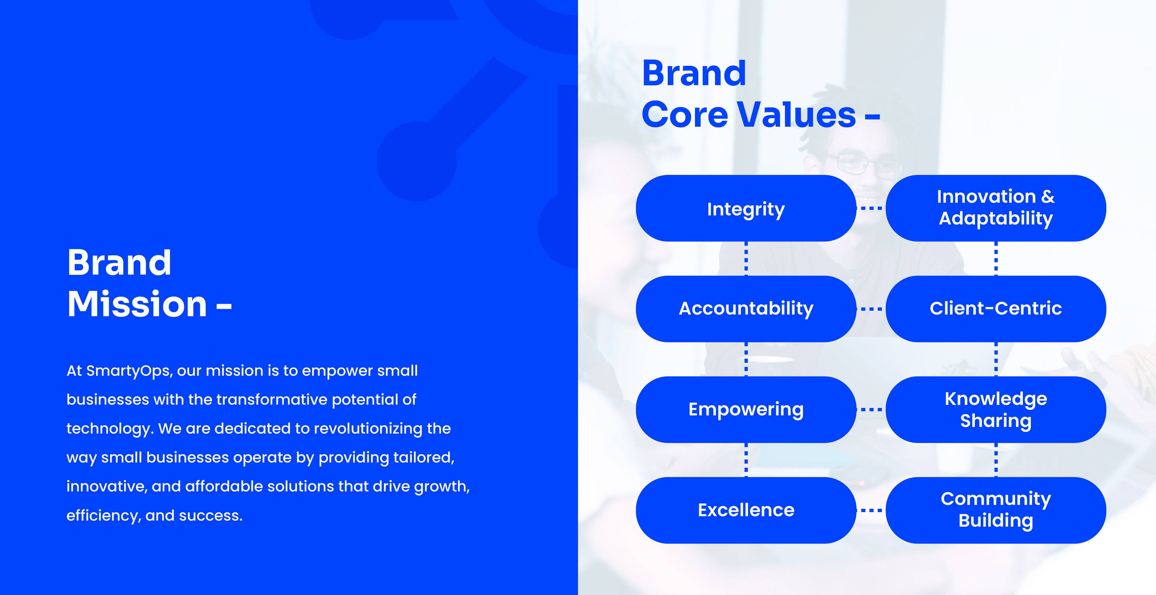
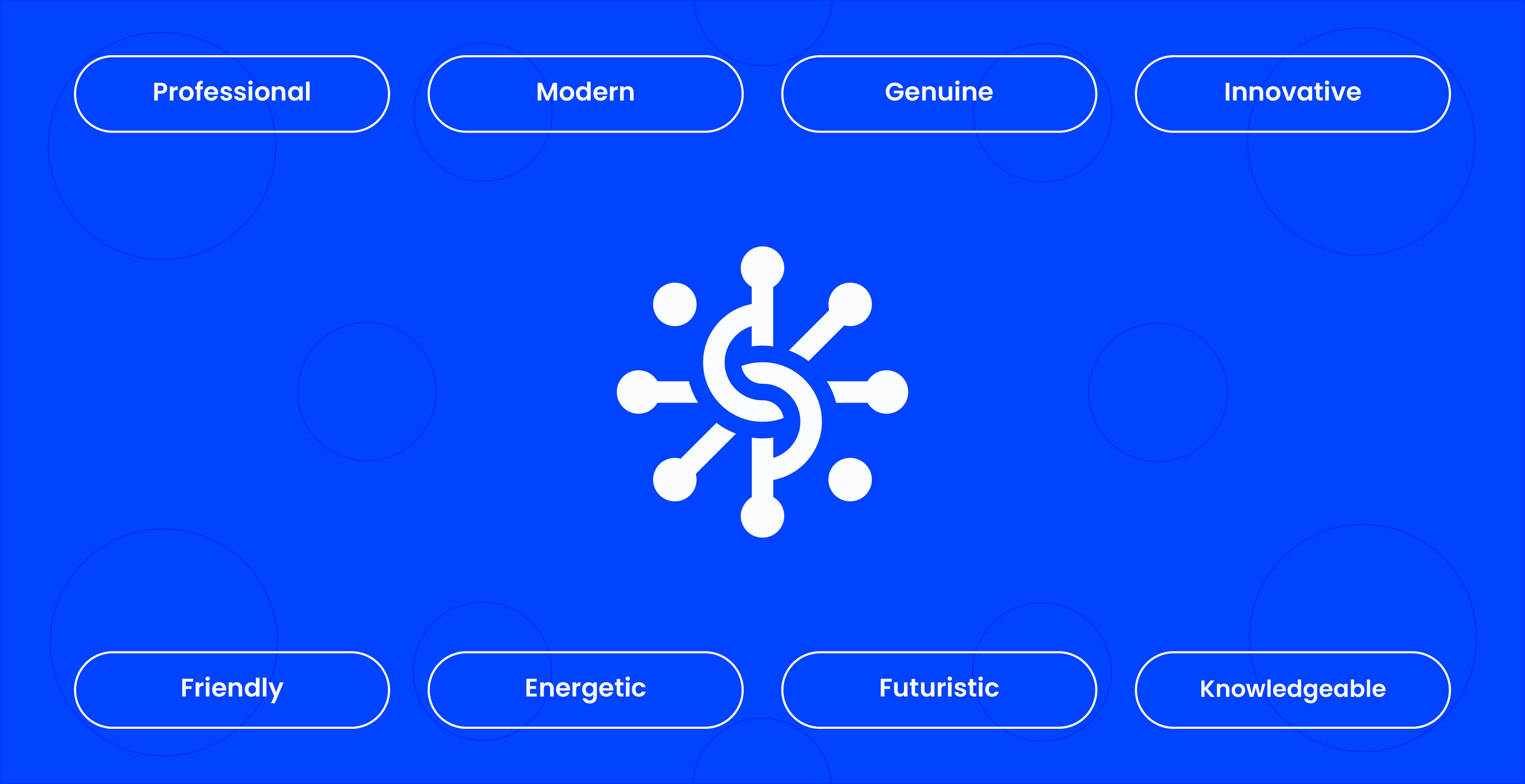
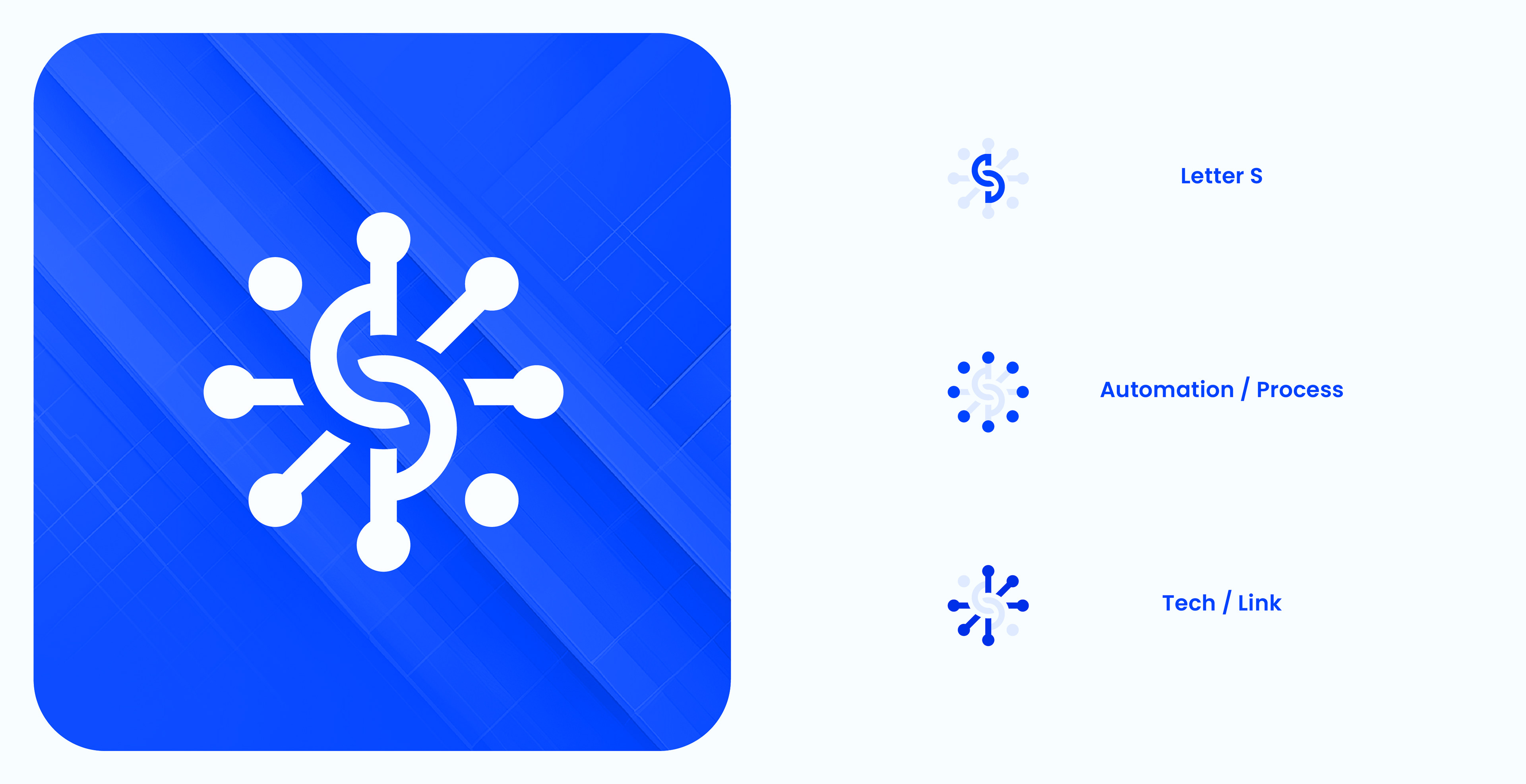
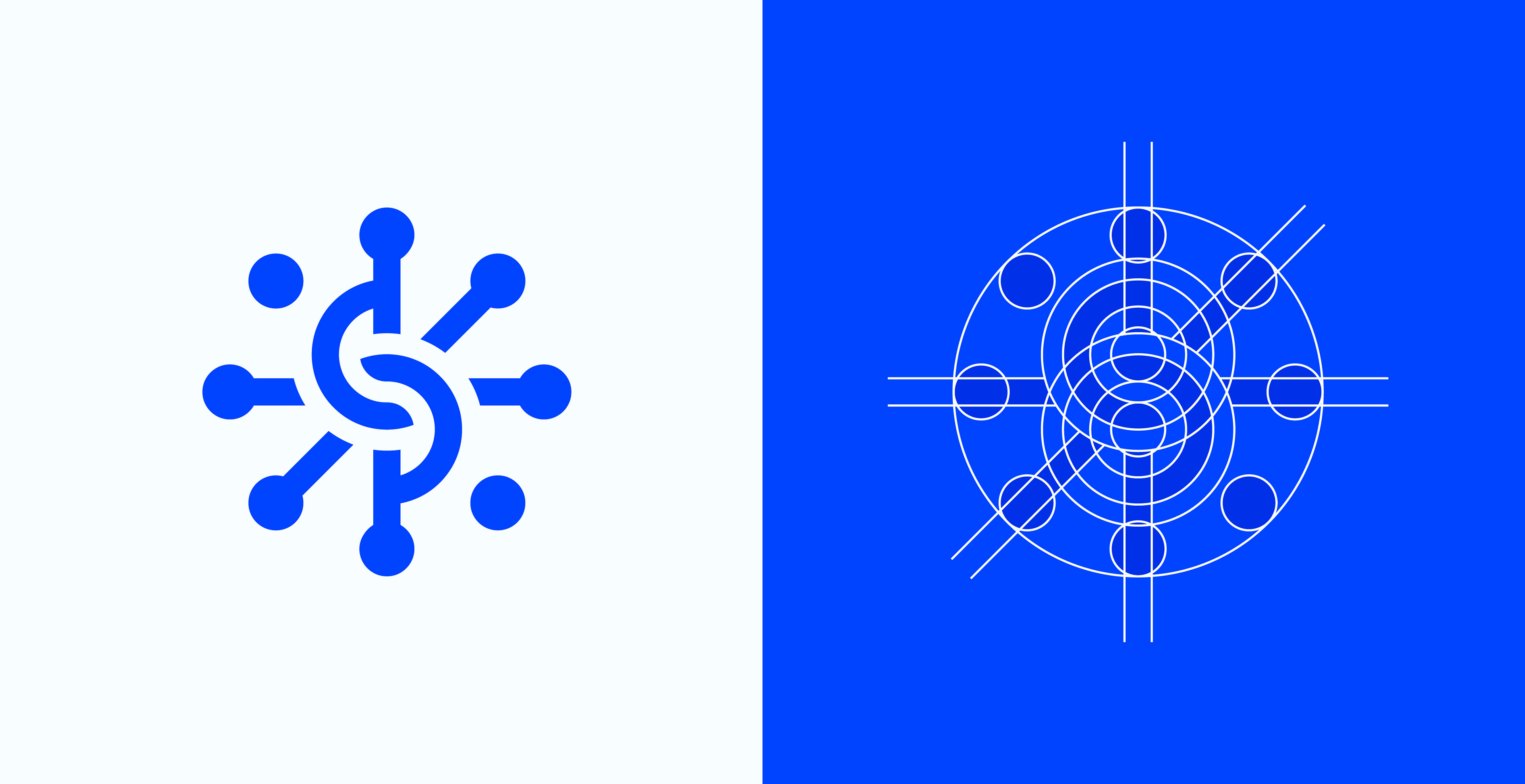
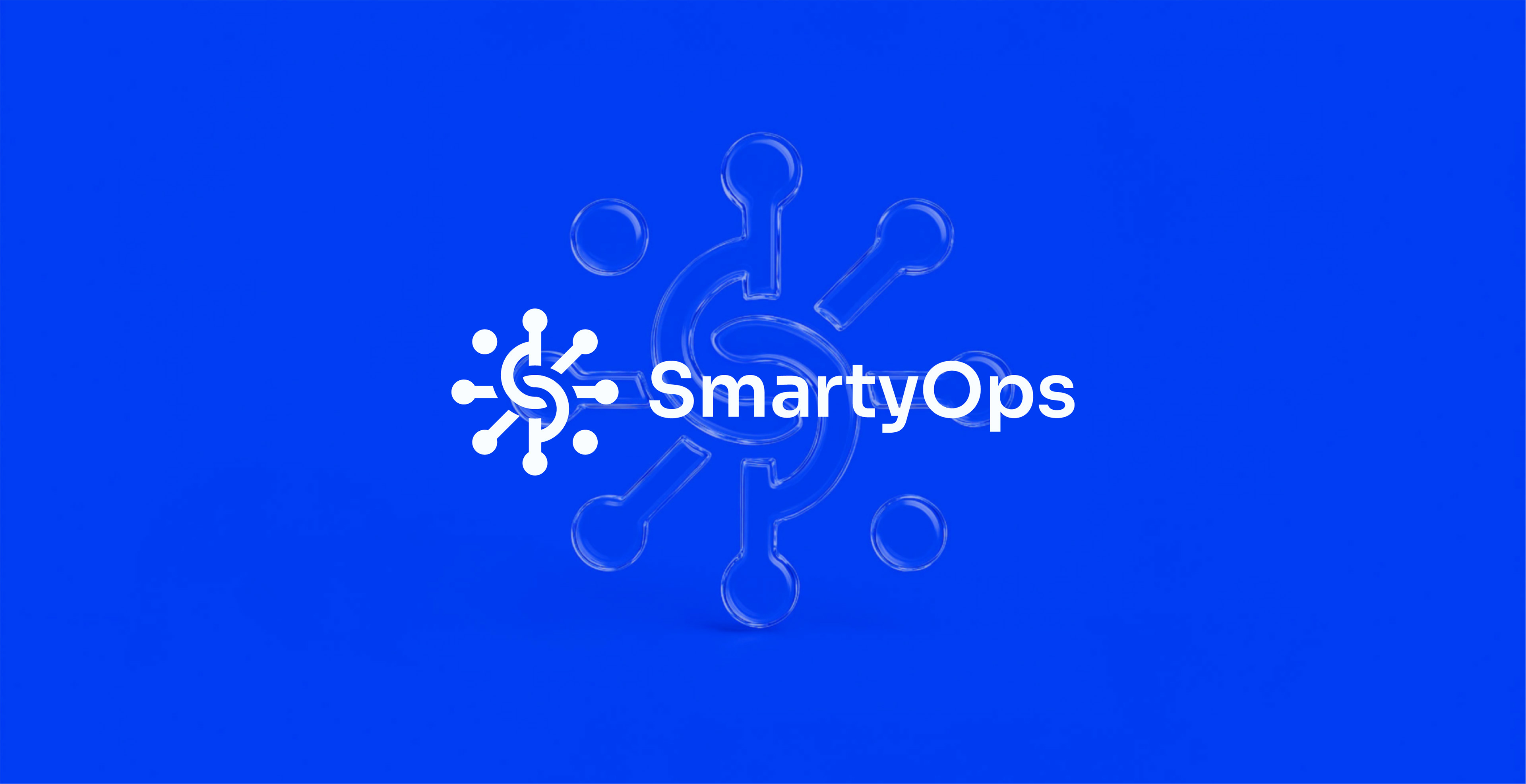
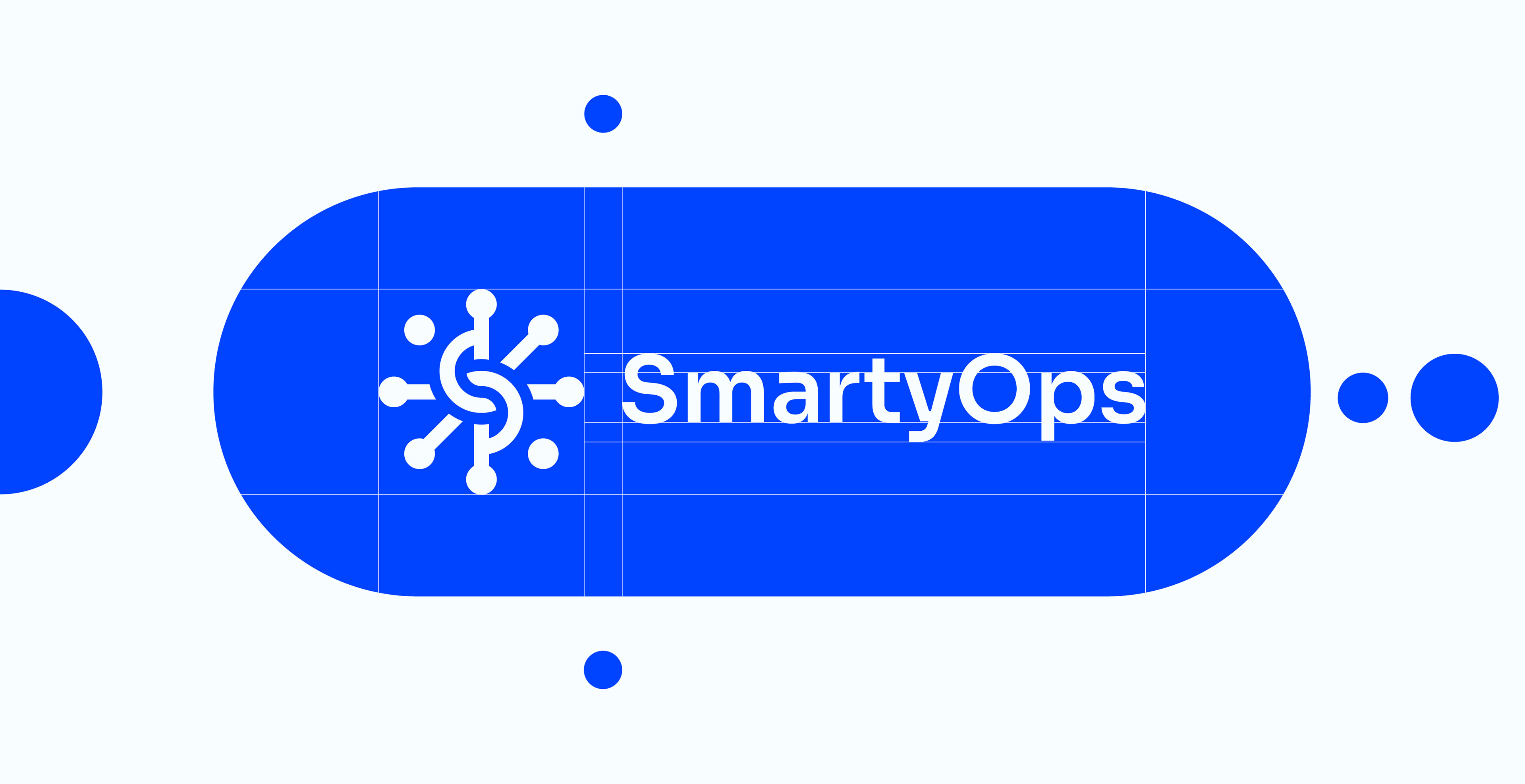
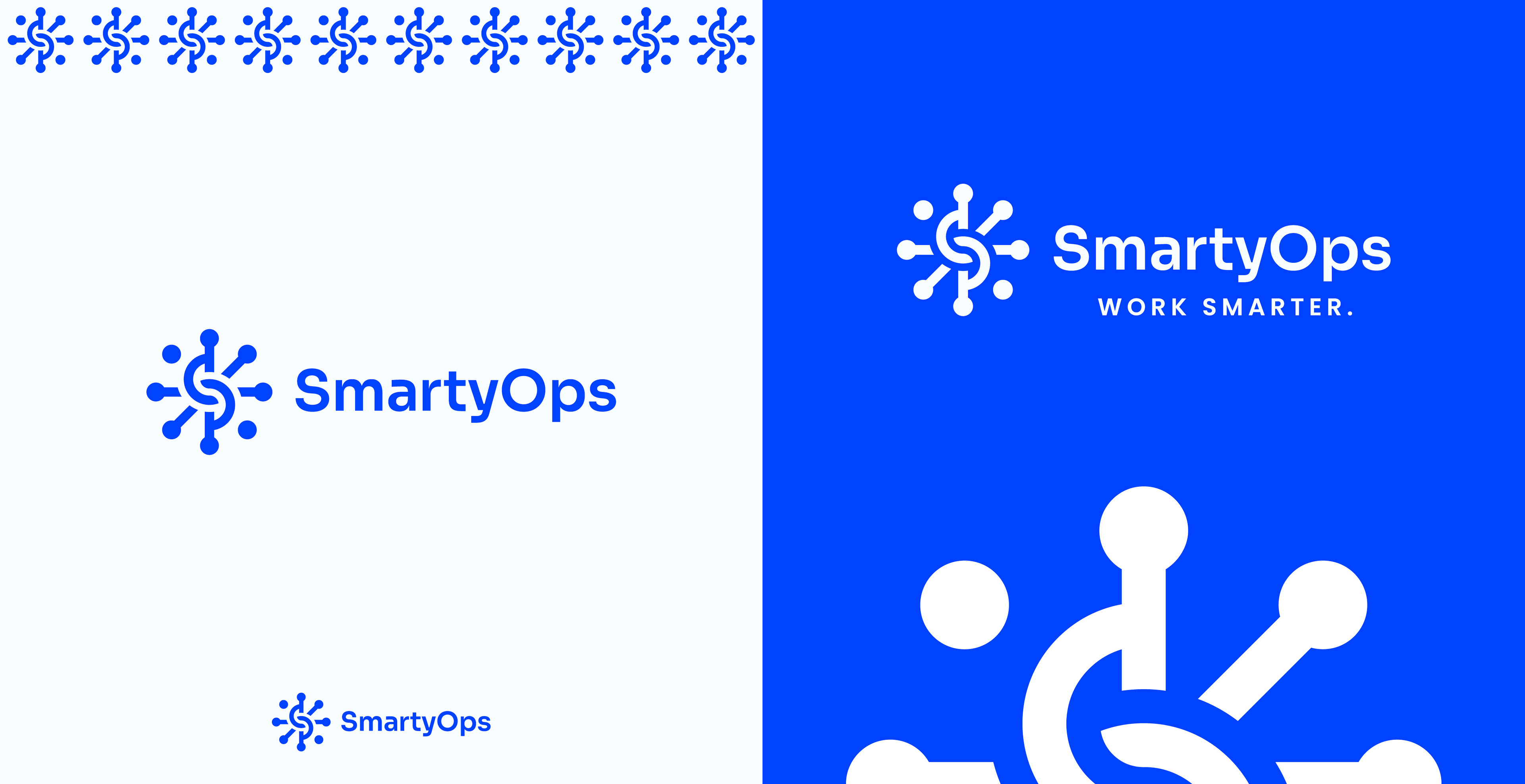
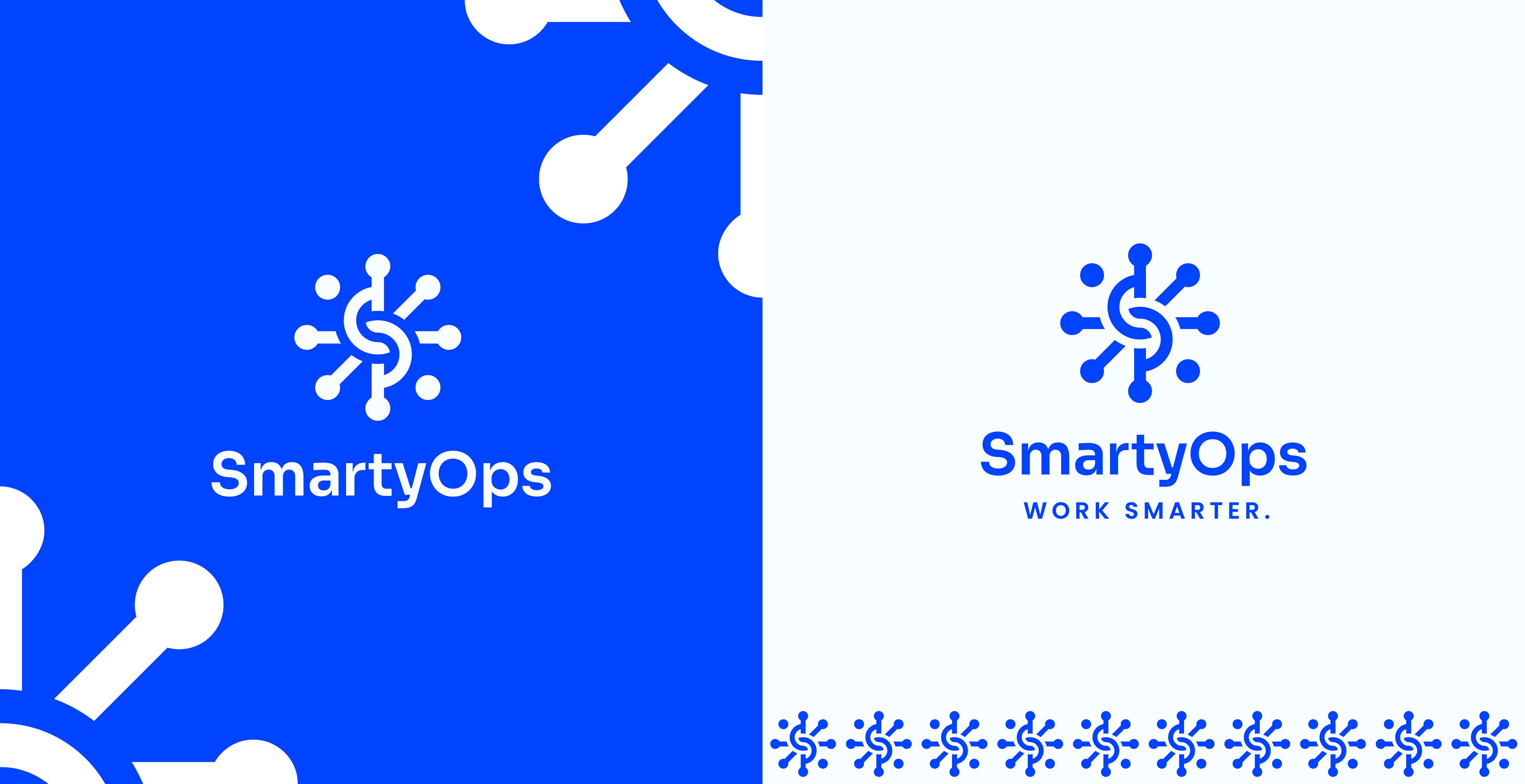
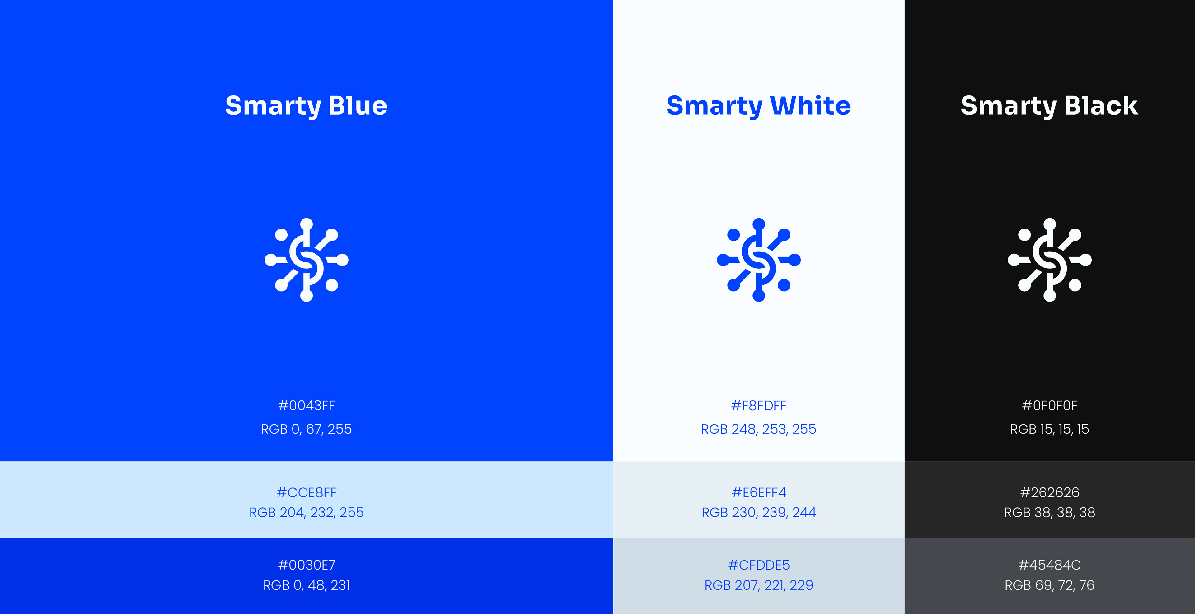
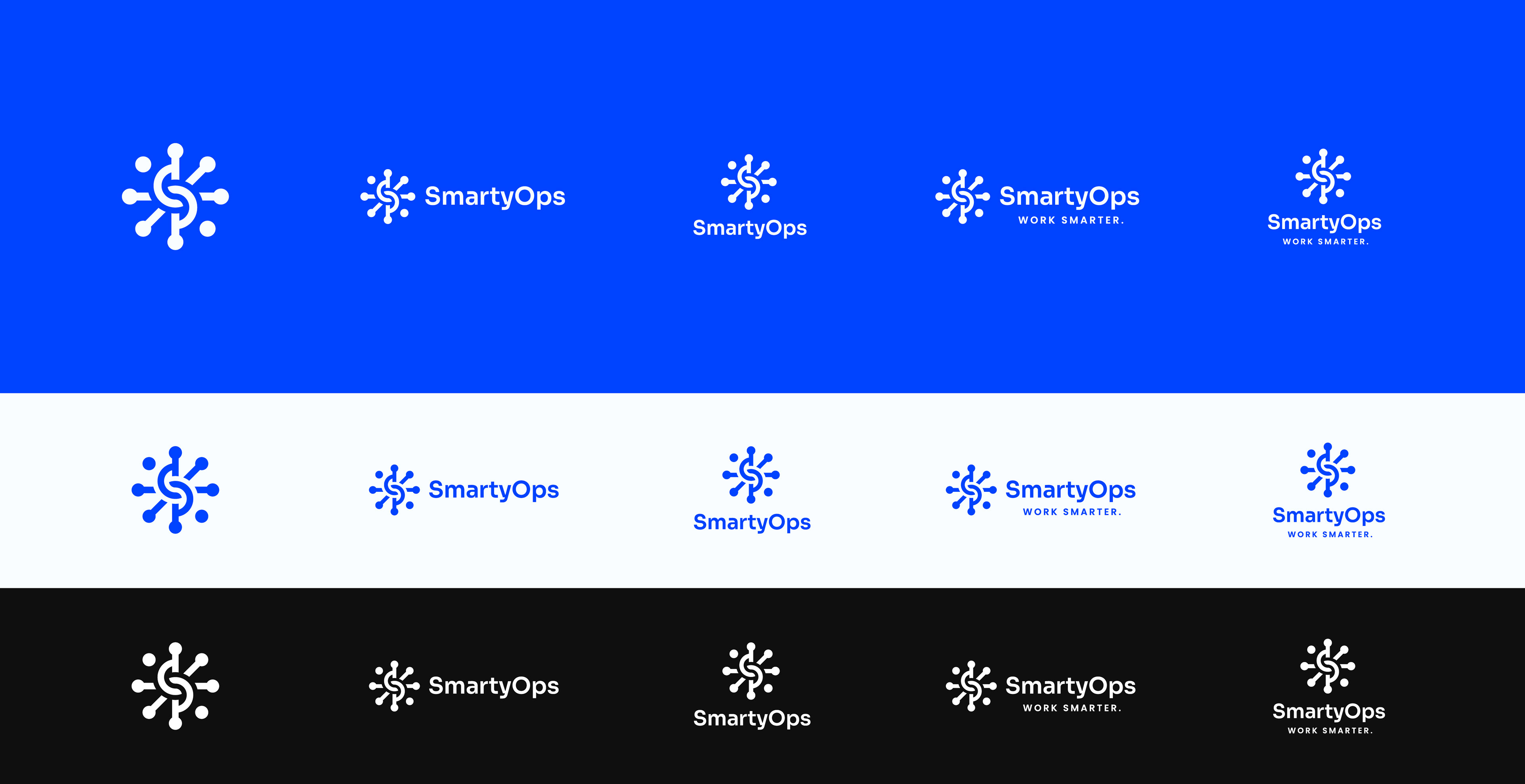
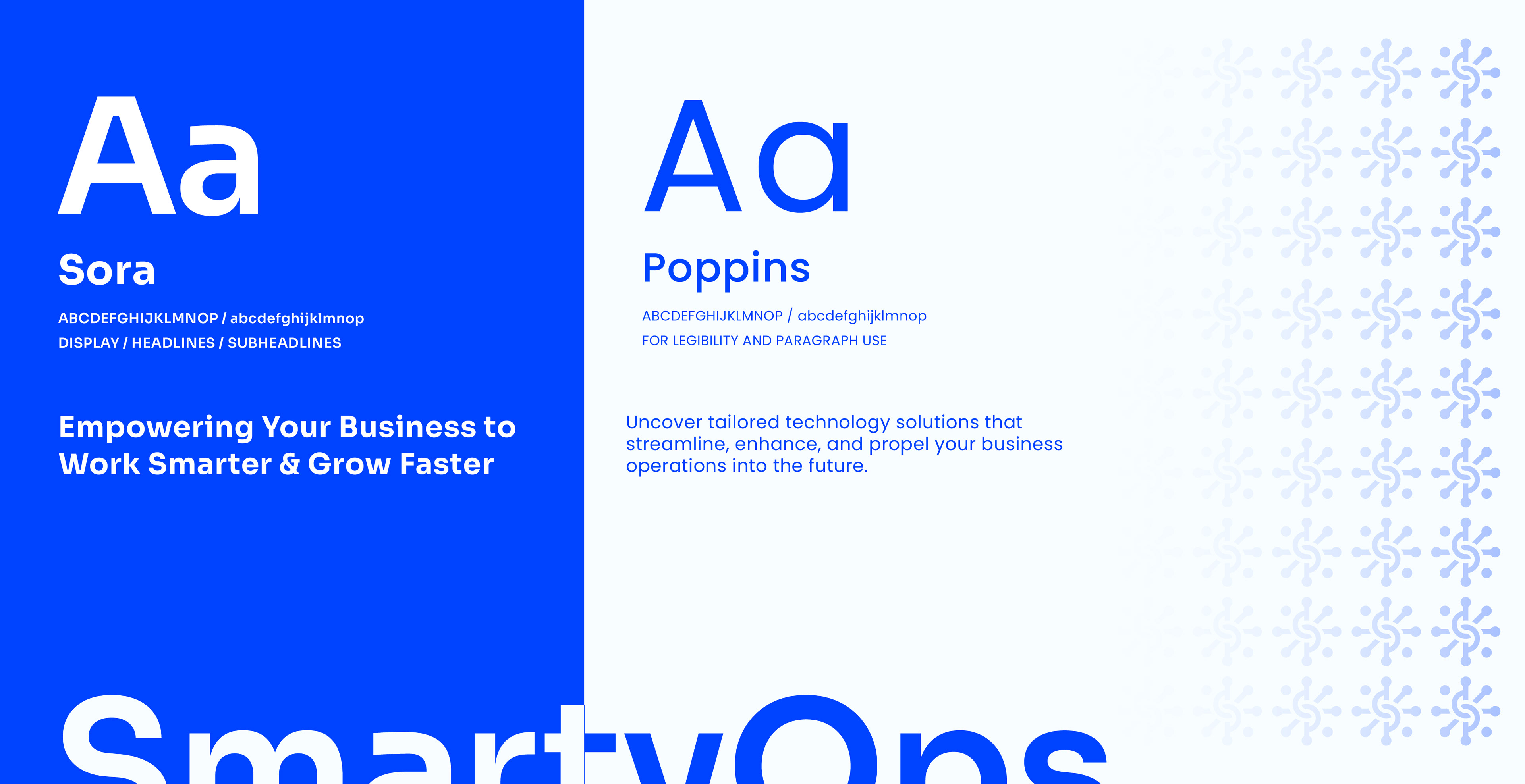
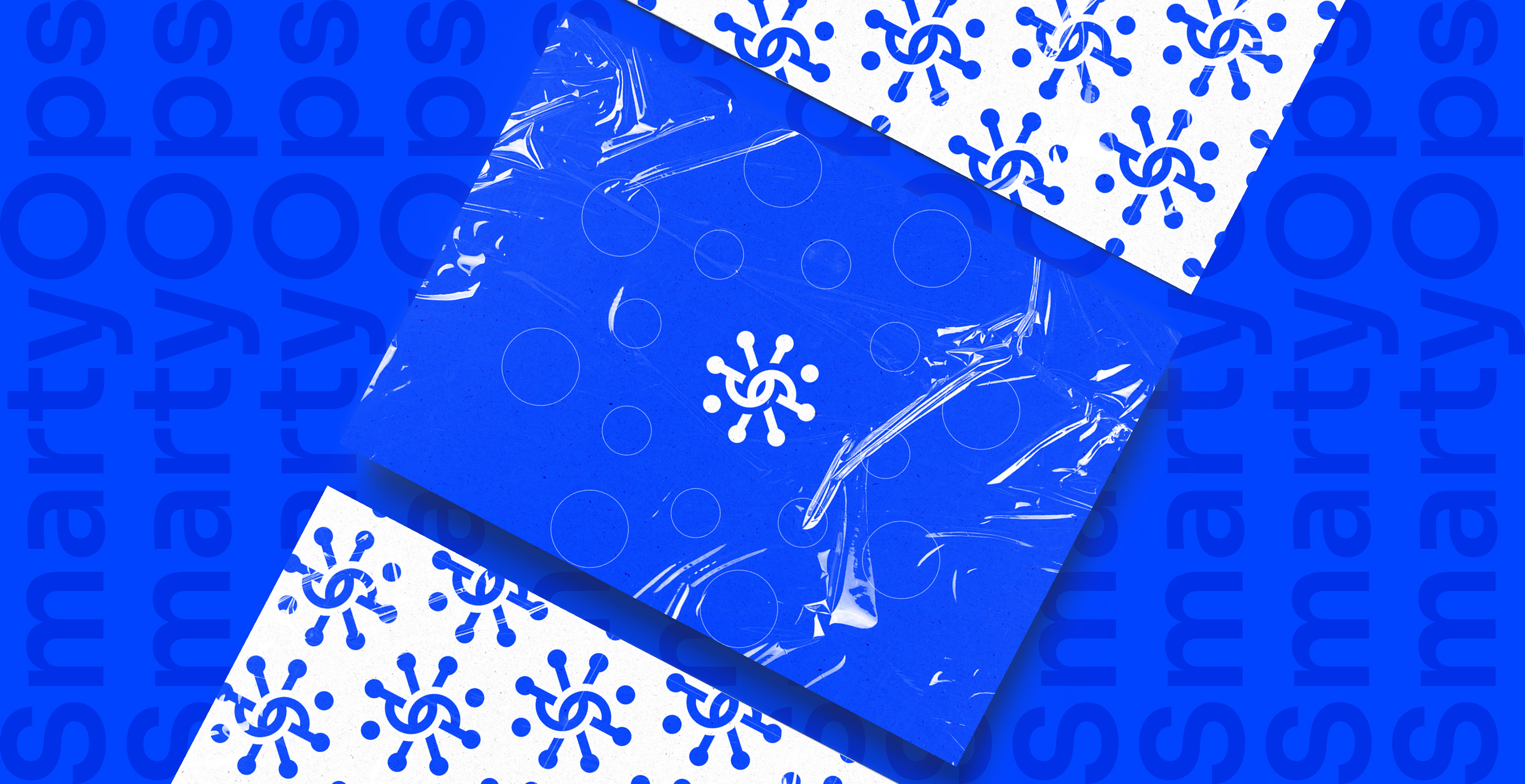
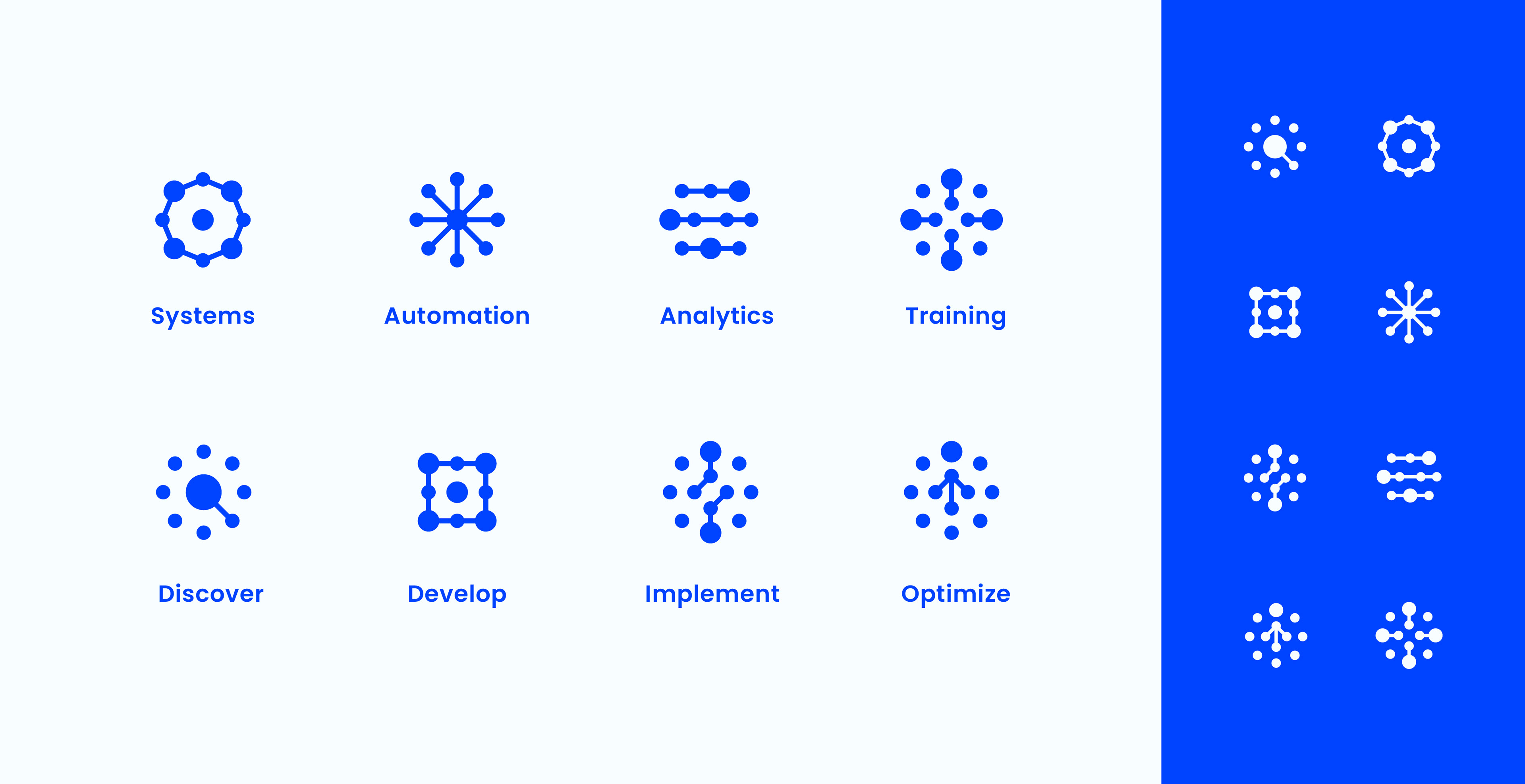
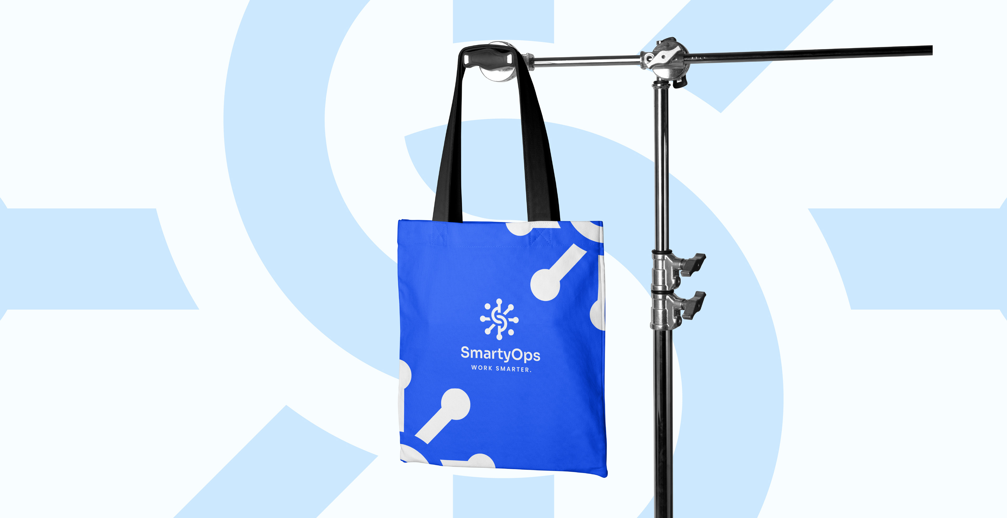
Every design decision was deeply rooted in SmartyOps’ core values. The logomark draws inspiration from automation and connected tech nodes, symbolizing streamlined efficiency and the founder's expertise. The color palette centers on Smarty Blue, a vibrant yet controlled hue that embodies reliability, trust, and empowerment. Typography was chosen to strike a balance between personality and clarity. The result is a visual rhythm that feels both confident and coherent.
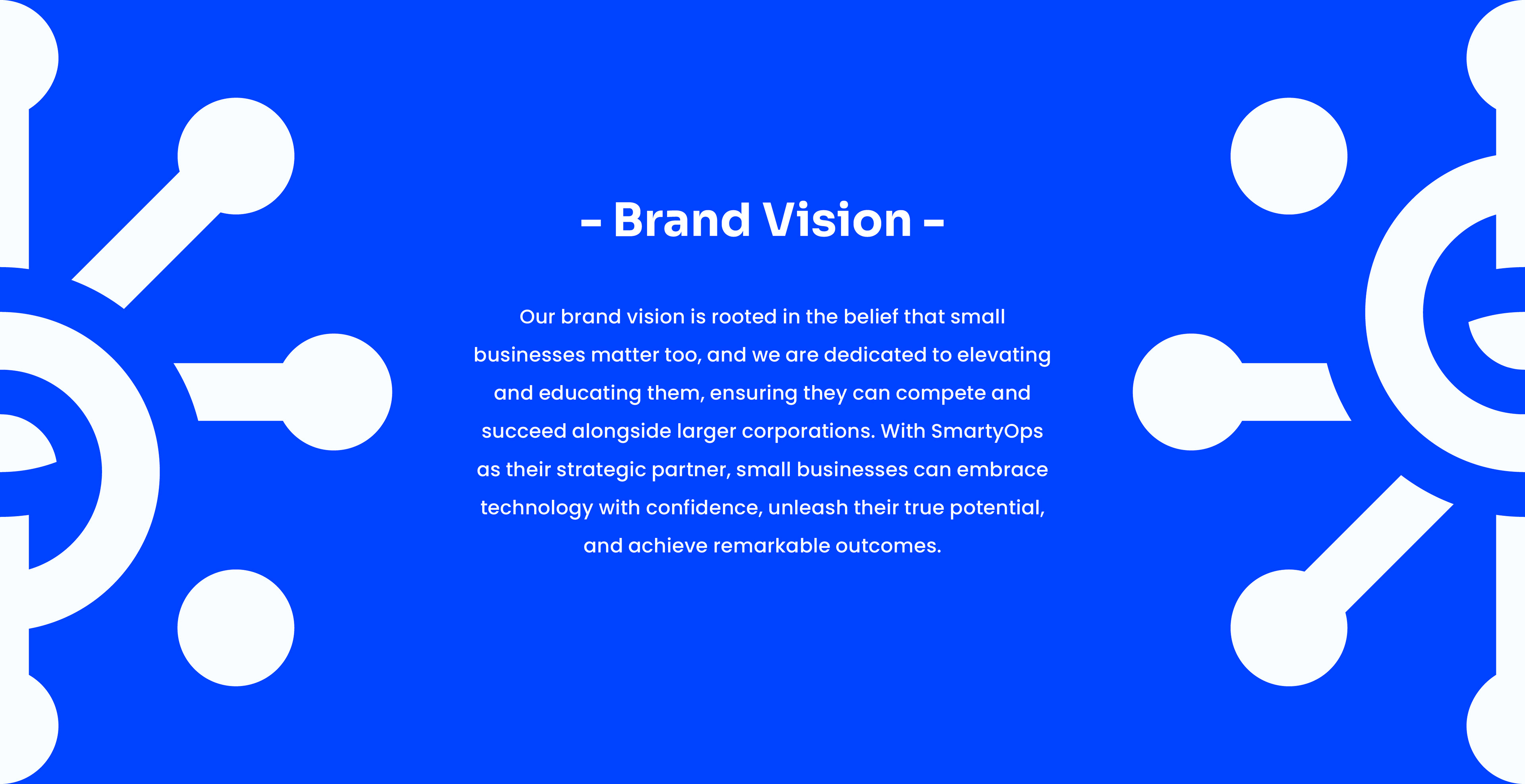
What emerged is a brand identity built for scale: instantly recognizable, systematized for digital performance, and infused with a quiet intelligence. A brand that doesn't just say "tech", it demonstrates what it means to work smarter and grow faster for their small businesses partners.
| INDUSTRY
B2B Tech Sector
B2B Tech Sector